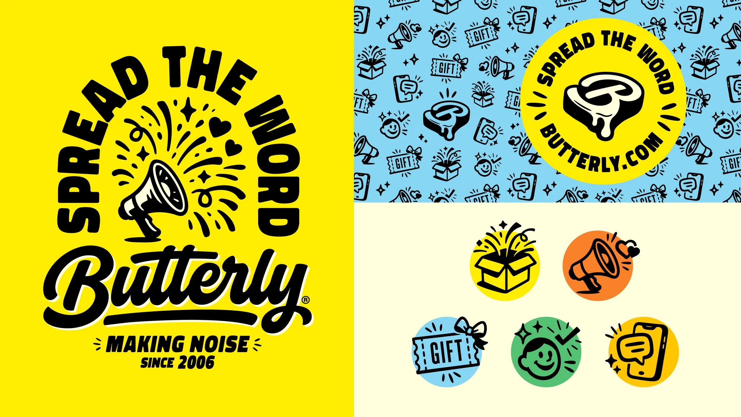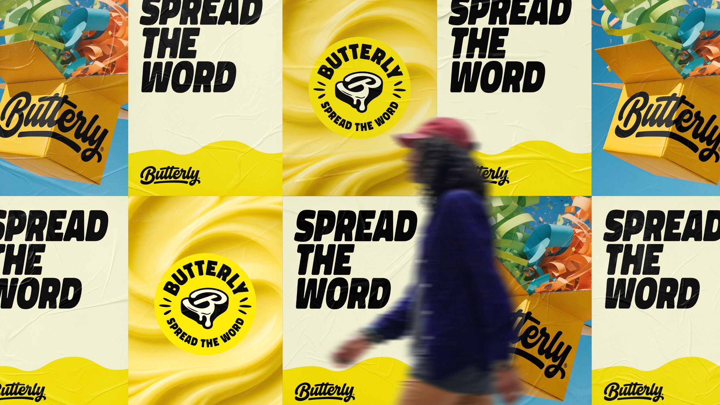
SPREAD THE WORD.
Butterly is a consumer advocacy platform that helps brands connect directly with real people to gather insights, reviews, and meaningful feedback. Built around the idea that better products come from better conversations, Butterly gives brands a way to listen, learn, and build trust using first-party relationships rather than distant third-party data. With two decades of experience in the space and an extended client roster including Dove, McDonald’s, Neutrogena, and Band-Aid, Butterly consistently proves its effectiveness through a comprehensive process and actionable results.
As the platform grew, the brand needed an identity that echoed the clarity and engagement it had become known for. The Butterly folks came to us with the challenge of a brand refresh: to retain a firm grasp on the foundations they had established, but to refine, expand, and express the identity to meet the demands of today’s saturated digital marketing space.
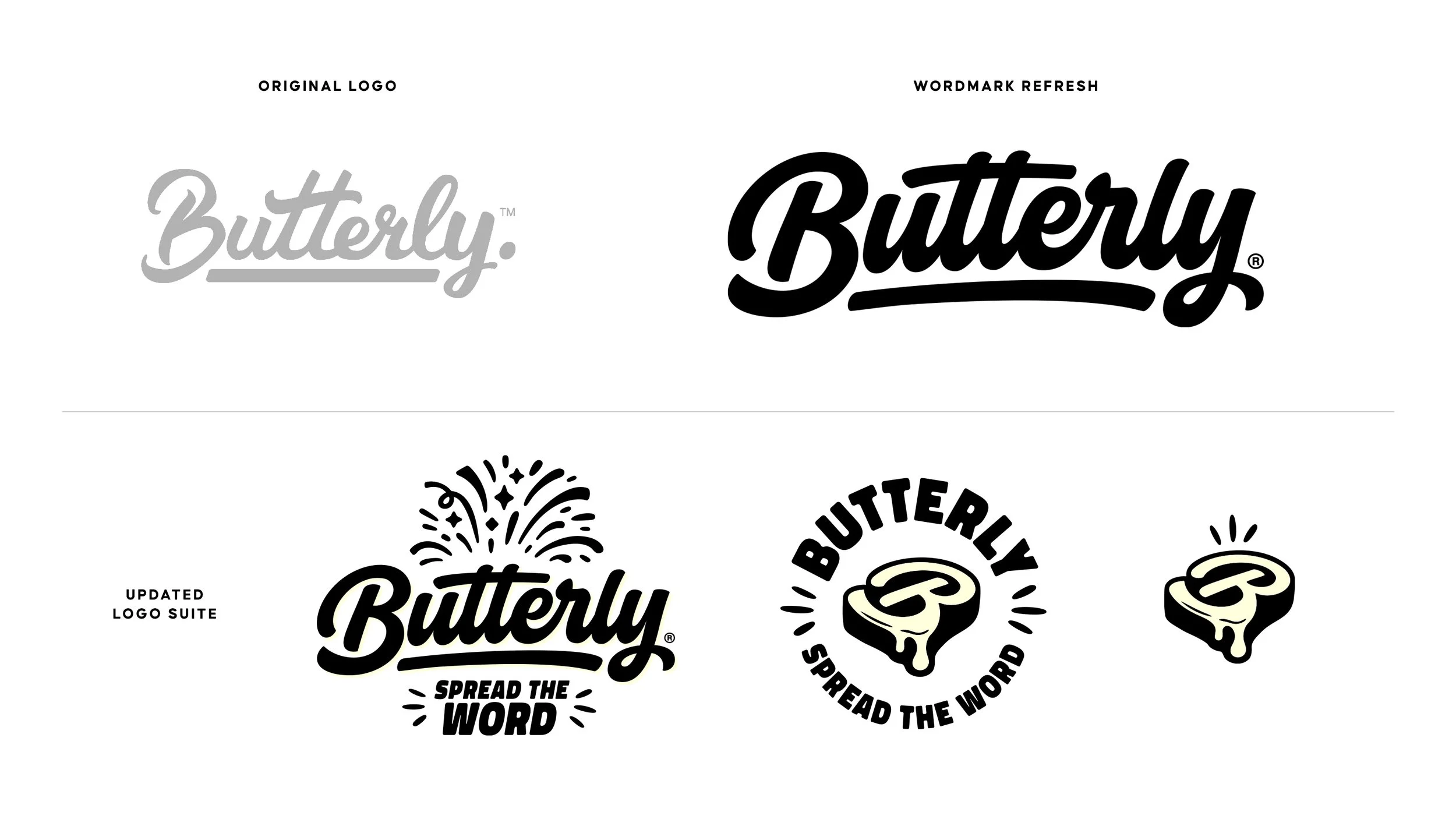
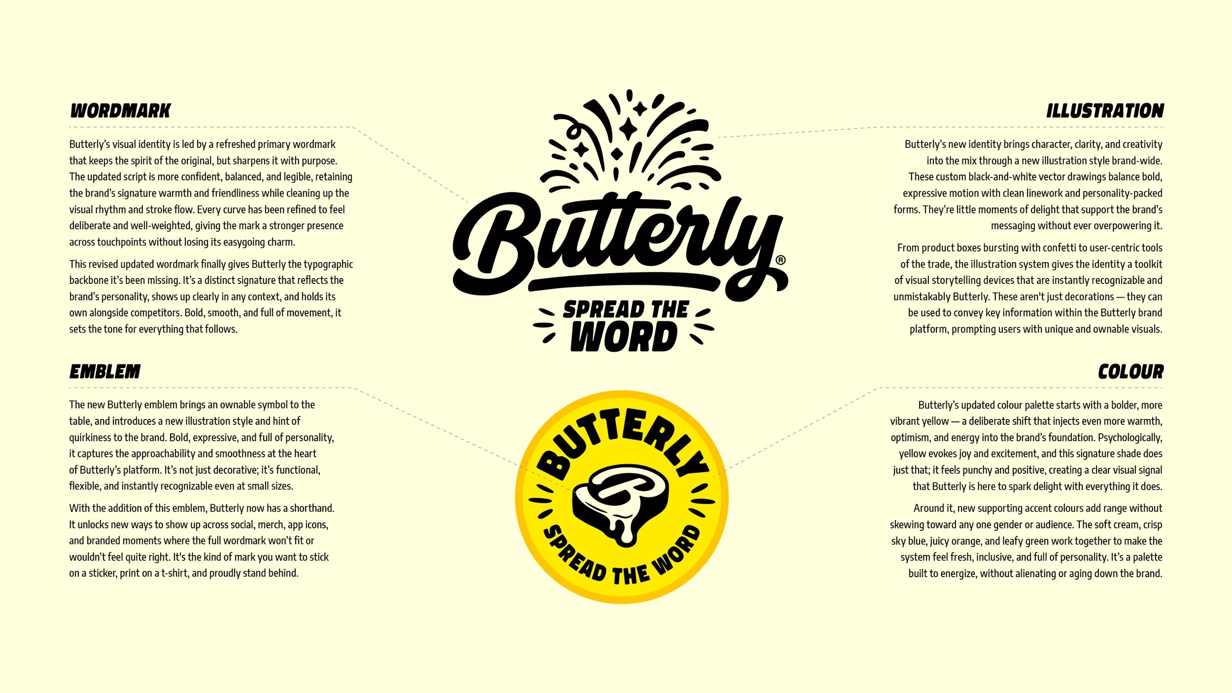
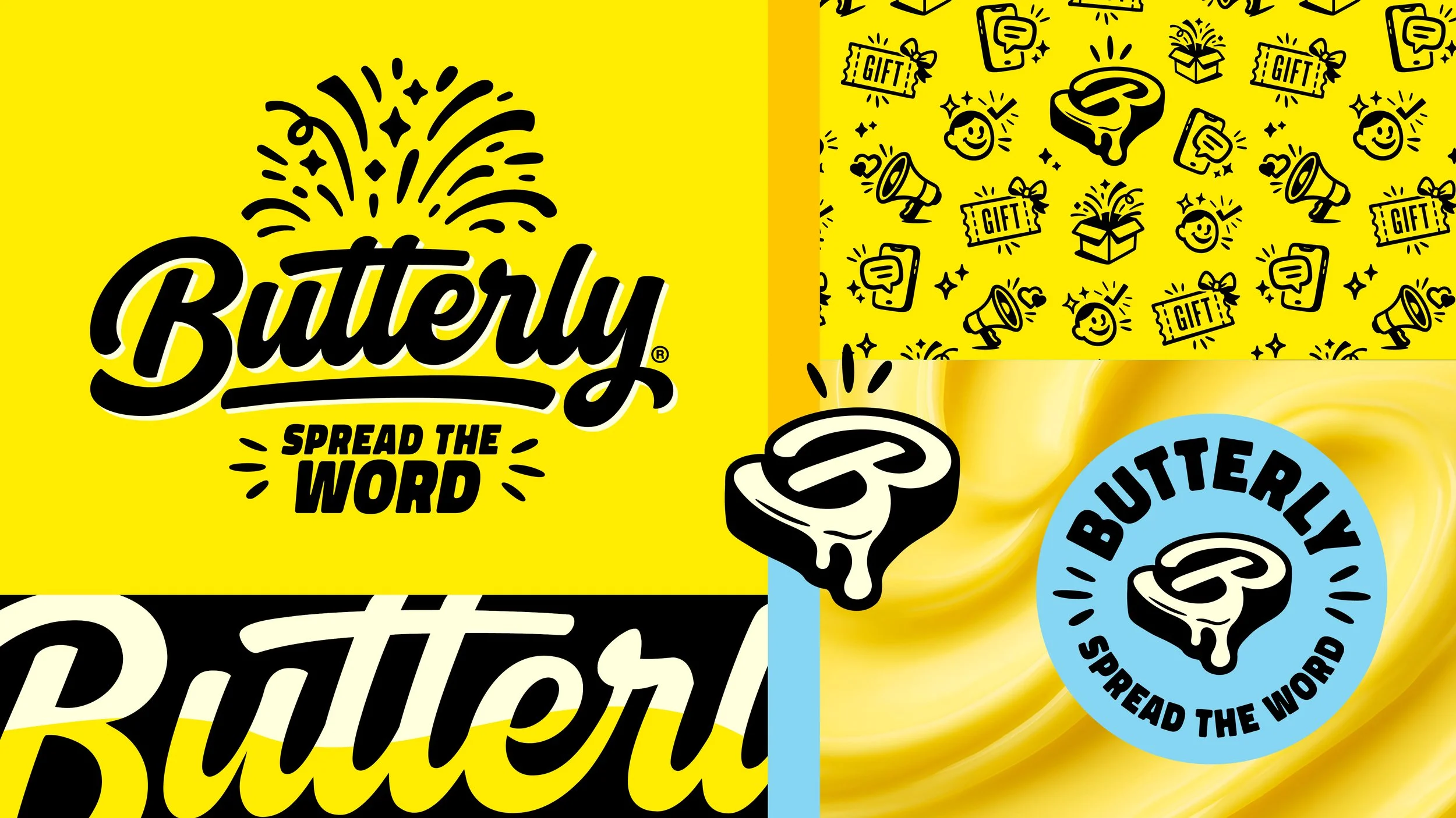
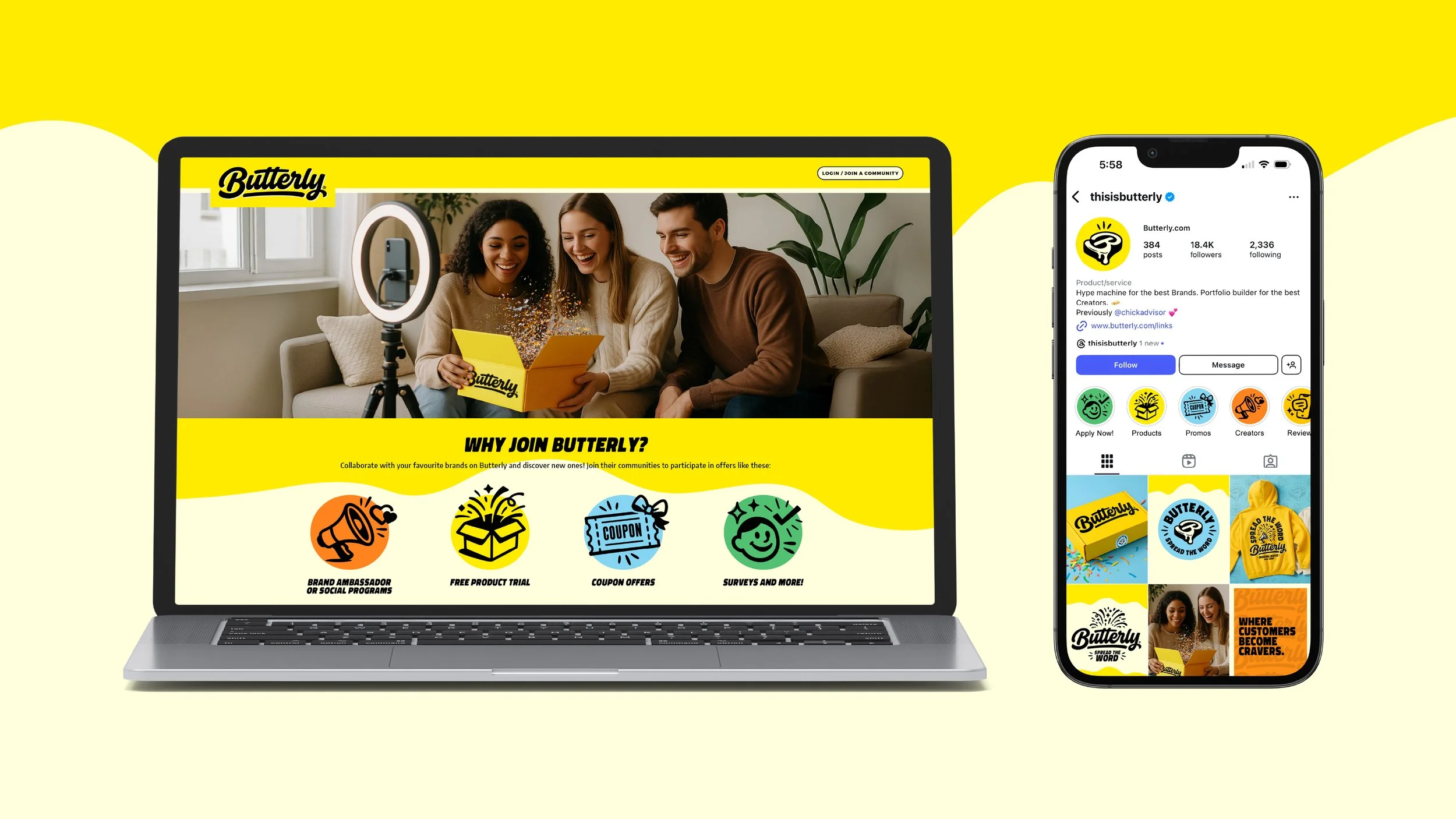
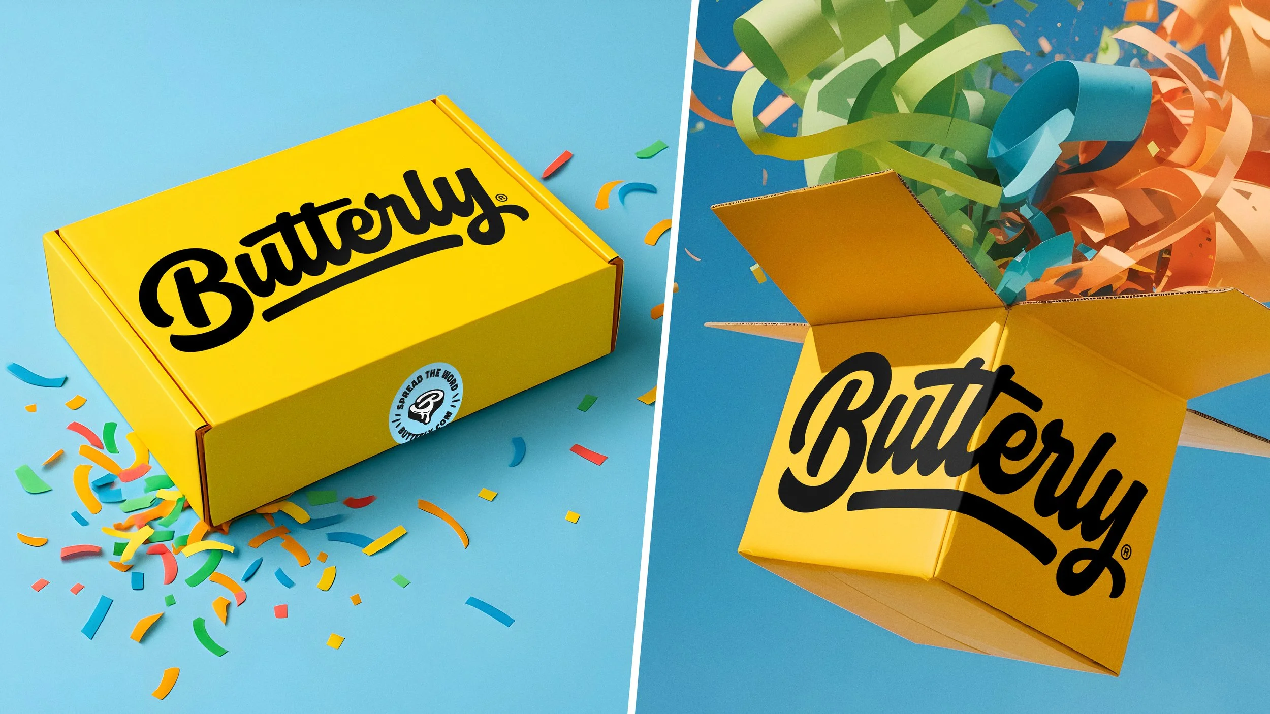
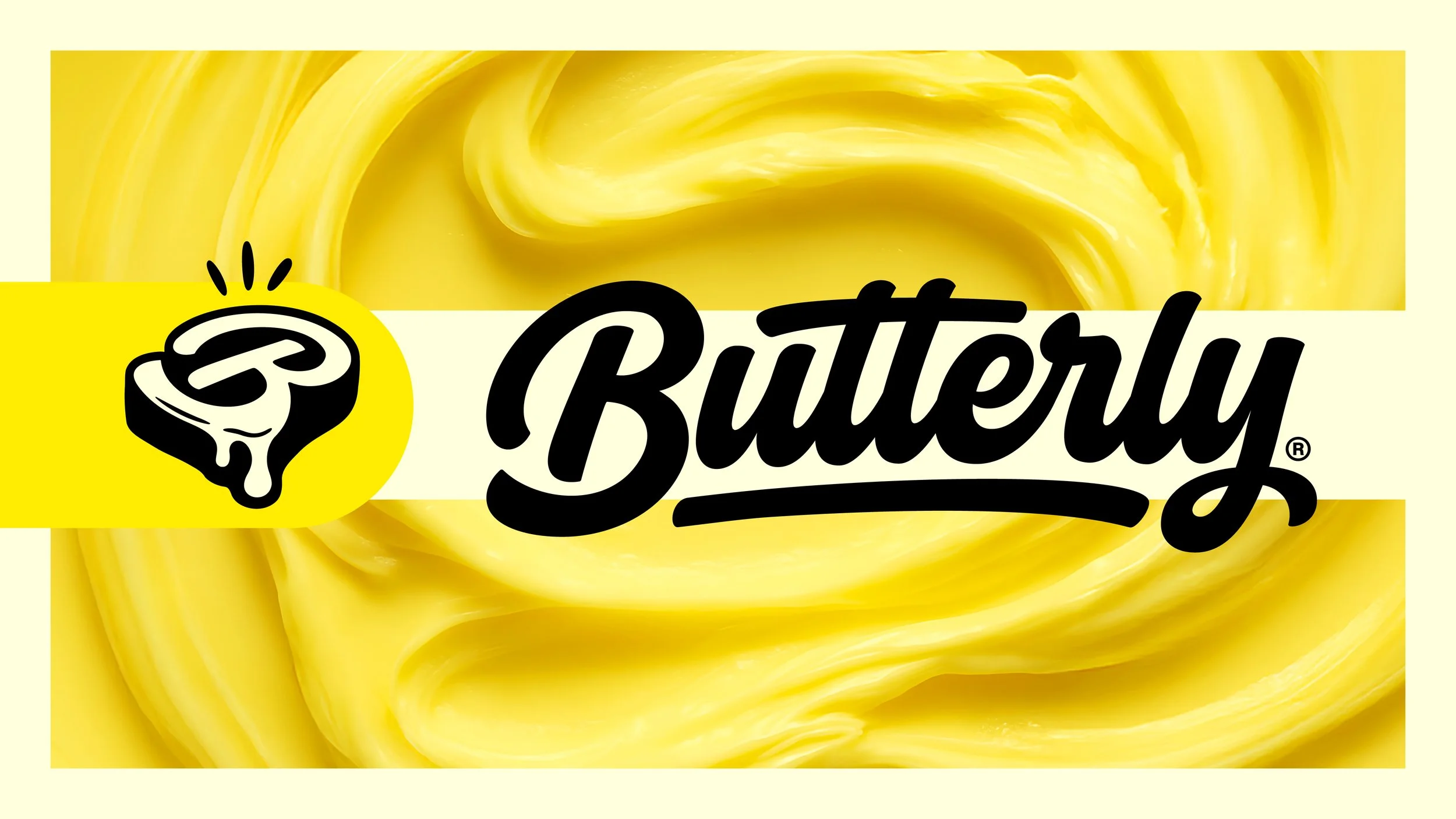
We began Butterly’s visual identity refresh with a stronger typographic backbone, led by a more polished primary wordmark inspired by the original along with a new emblem that adds personality and flexibility across touchpoints. Leaning into imagery and textures inspired by actual butter brings a cheeky and unmistakable visual edge to differentiate from competitors. A bold, energetic color palette and a playful illustration system bring clarity and motion to everything from product UI and marketing to packaging, merch, and social. The result is a flexible, energetic system that feels welcoming and polished, giving Butterly a visual voice that’s as friendly and engaging as the community it’s built around.
-
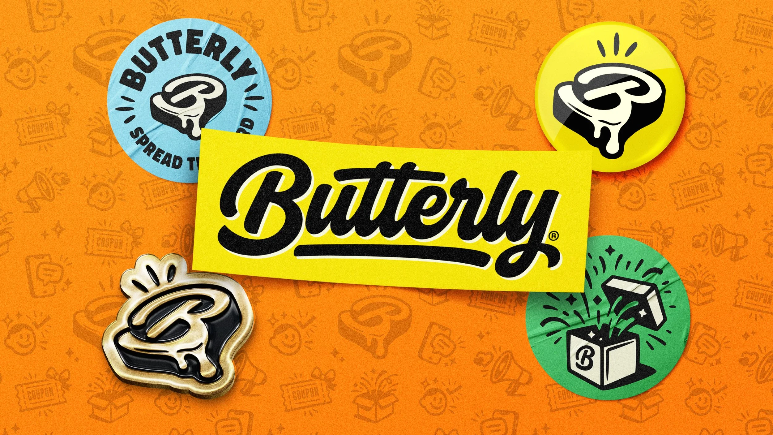
Logo Suite, Colour, Typography, Pattern, Copywriting
-
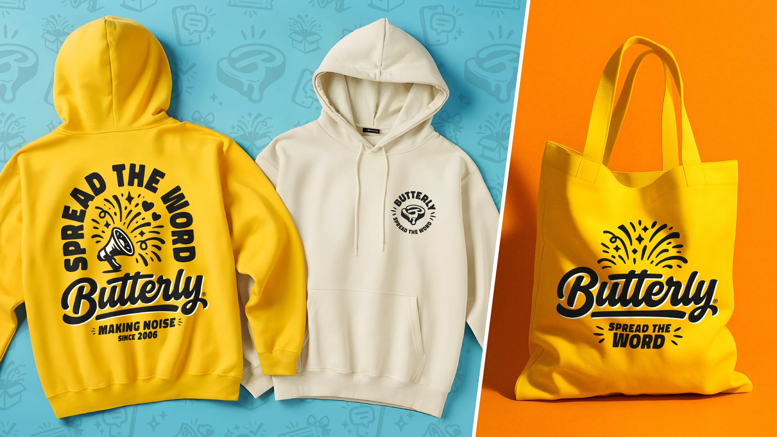
T-Shirts, Sweaters, Hats, Tote Bags, Stickers