Brighter Days Through Balanced Bodies.
Connection Chiropractic was built around a simple belief: better health starts with better relationships. More than a traditional chiropractic practice, Connection focuses on long-term wellness through personalized care, genuine human connection, and a deep understanding of how the brain and body work together.
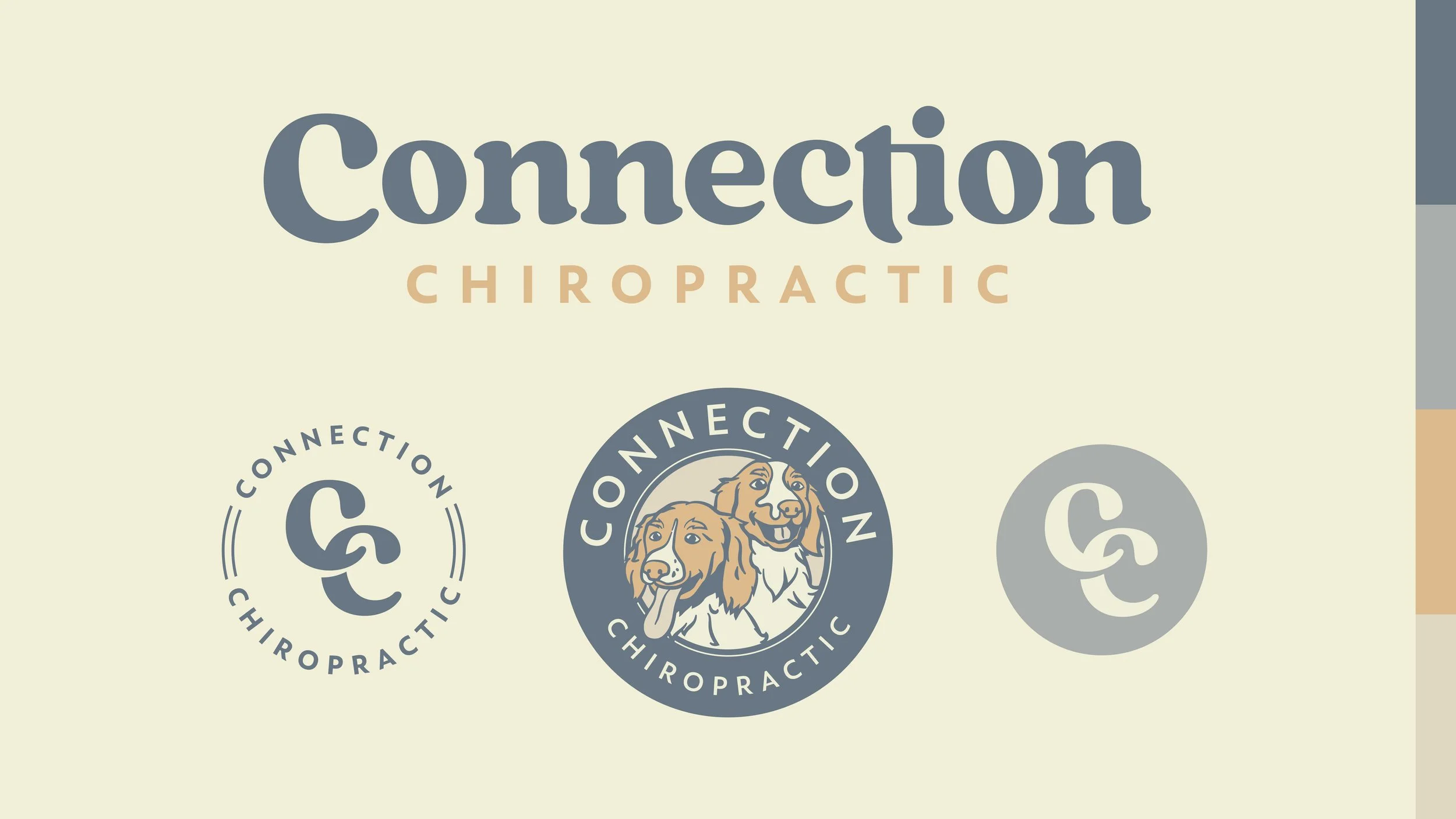
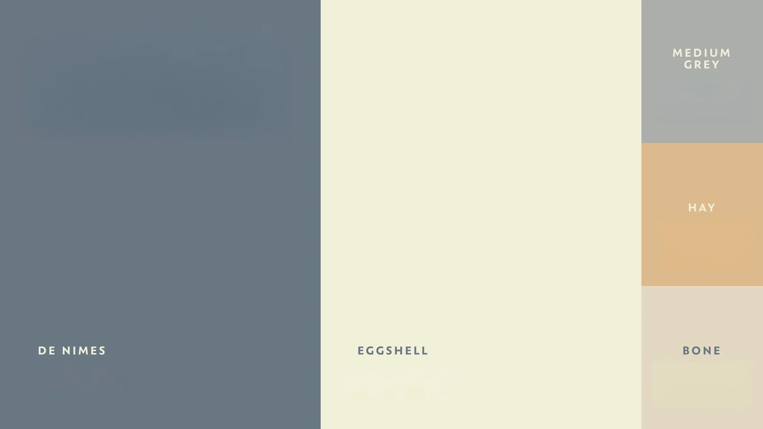
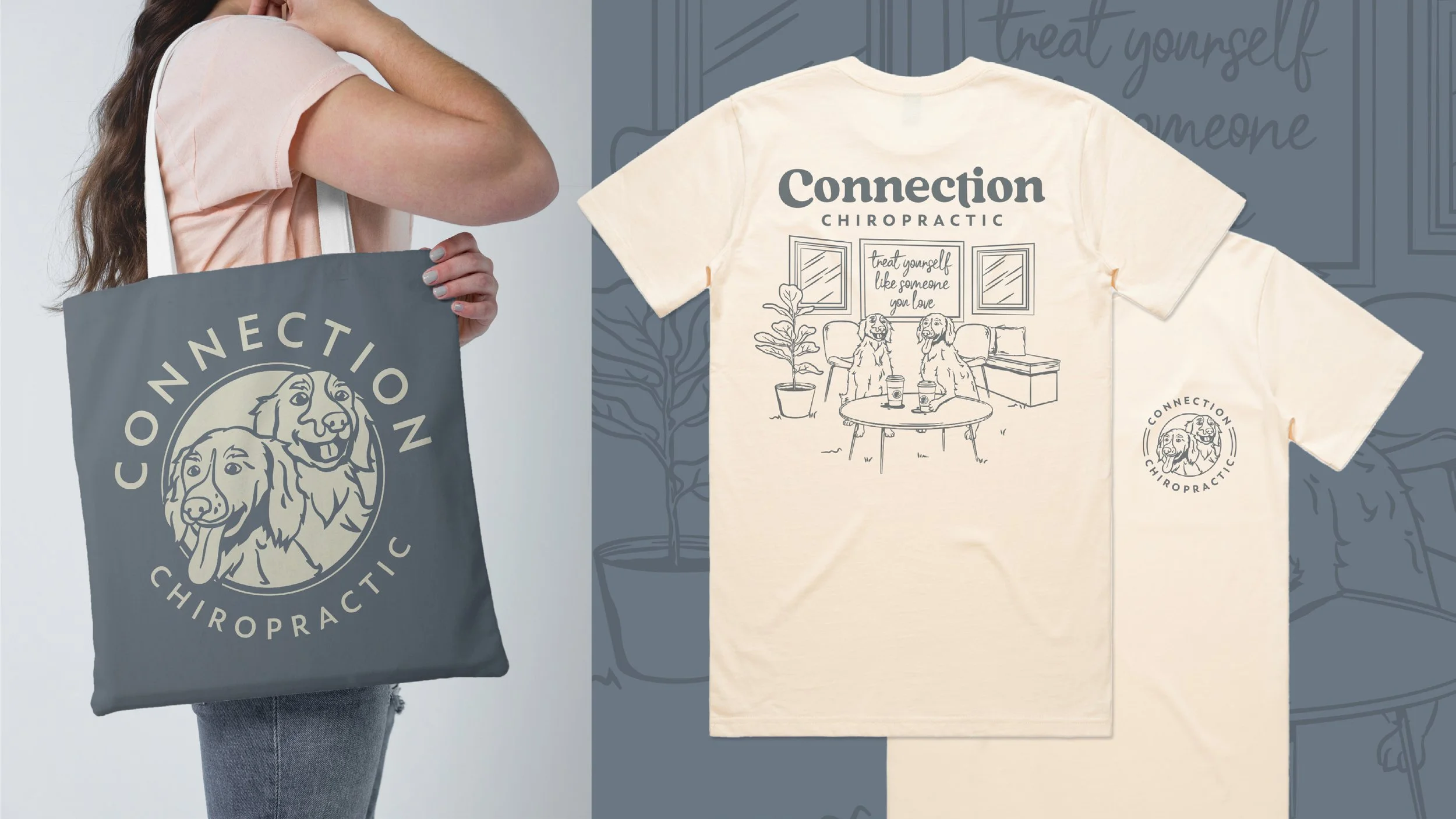
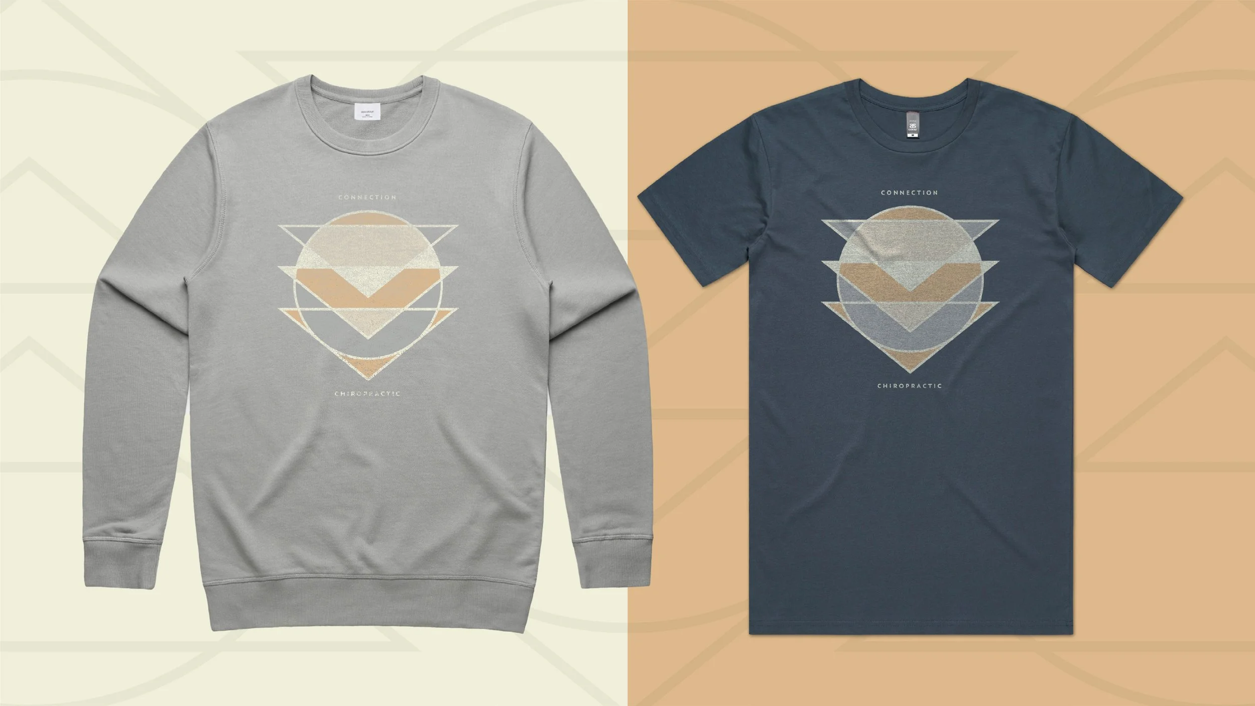
Our role was to create a brand identity that reflected that philosophy. One that felt warm, approachable, and knowledgeable without drifting into the overly clinical or overly alternative. The visual system balances softness with structure, pairing a friendly wordmark and supporting emblem with a calm, grounded color palette designed to put people at ease.
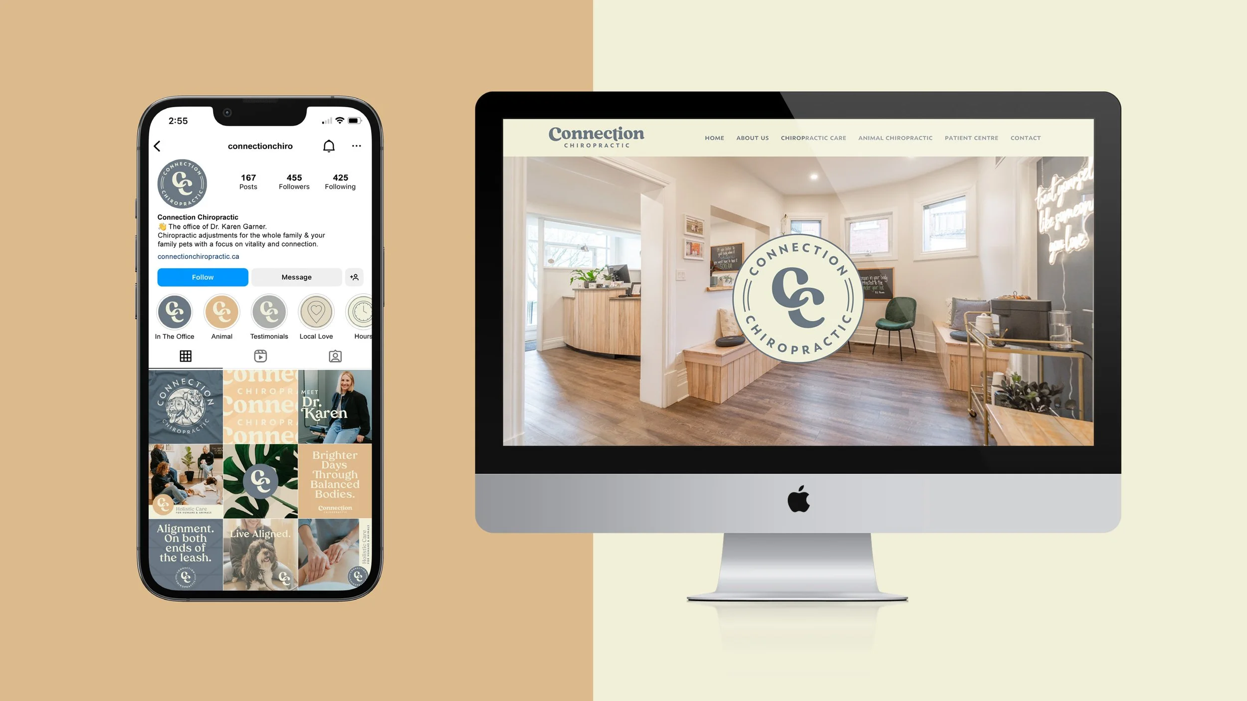
The result is a brand that feels welcoming and credible across every touchpoint—from the clinic space to digital and merchandise—reinforcing Connection’s position as a modern, community-driven approach to chiropractic care.
-
Logo Suite, Colour, Typography, Pattern, Copywriting
-
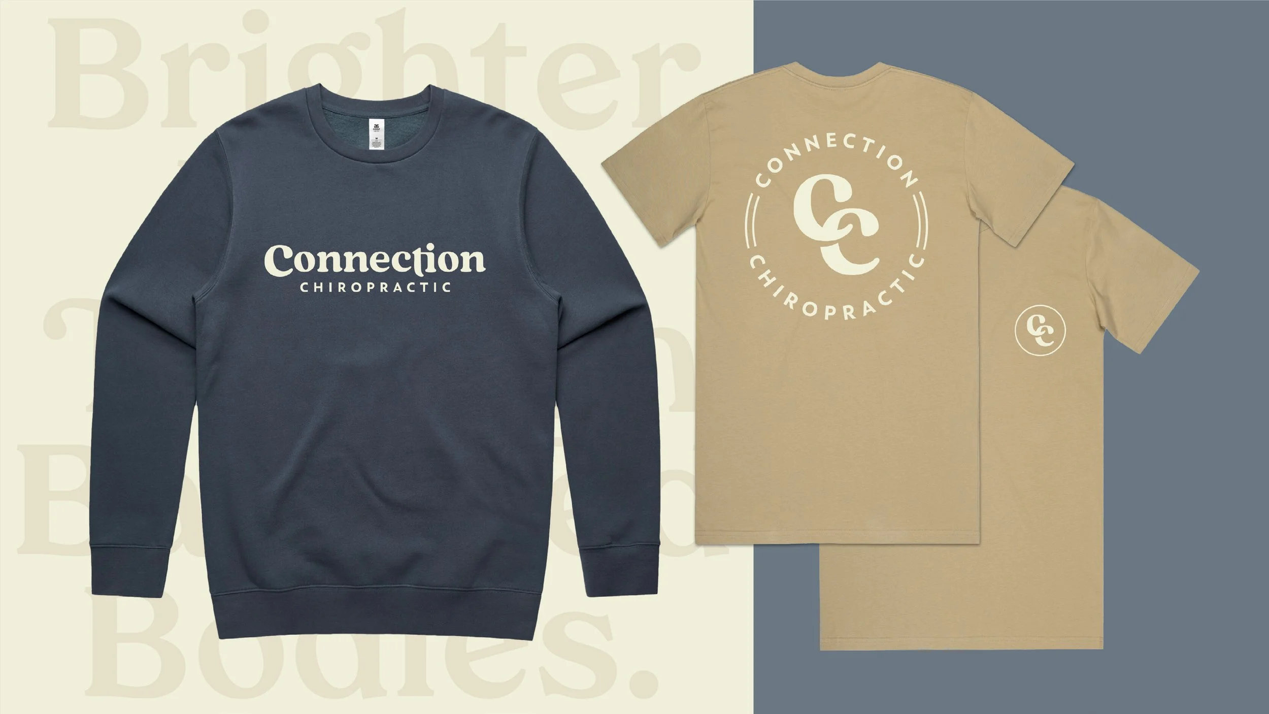
Staff Uniforms, T-Shirts, Sweaters, Hats
-
Exterior/Interior Signage, Menus, Stationery, Promotional Materials