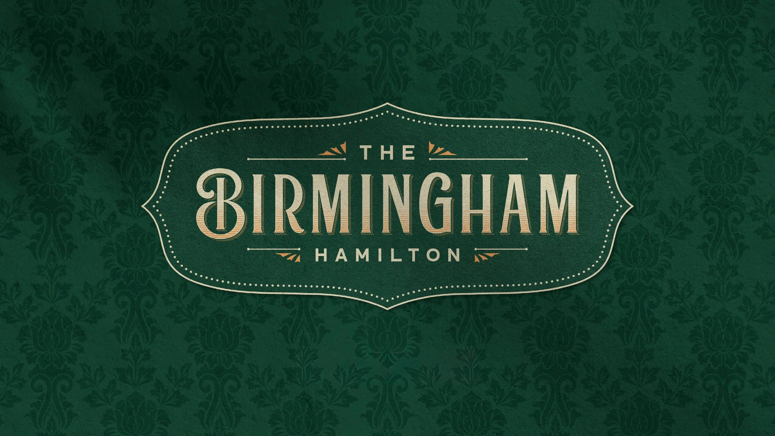
History, refined.
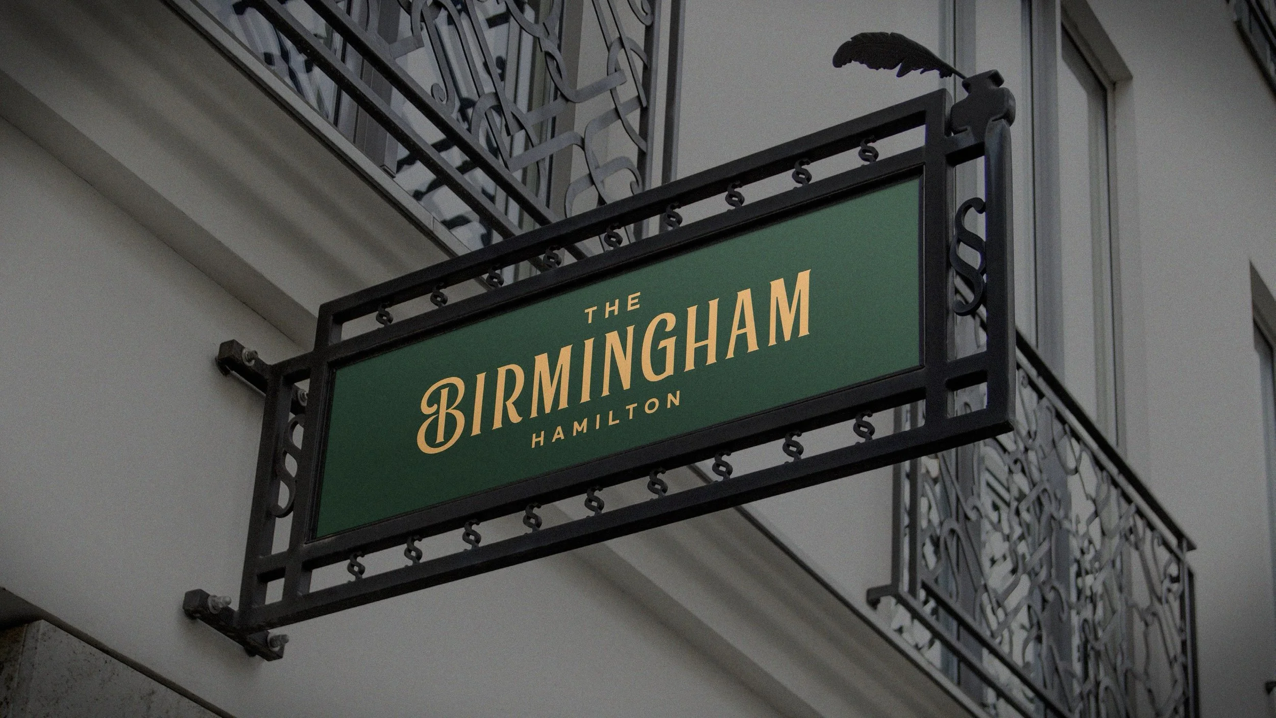
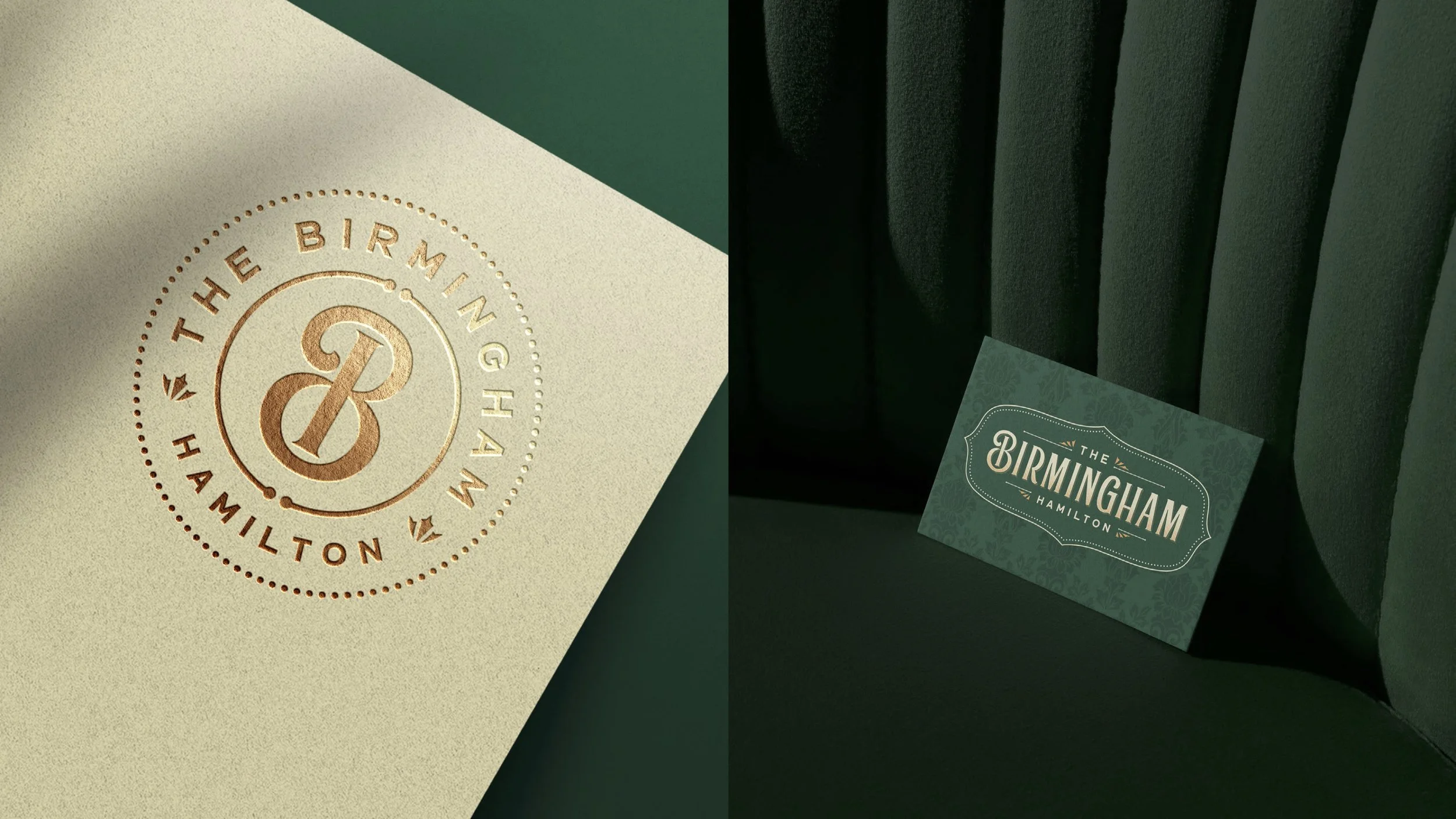
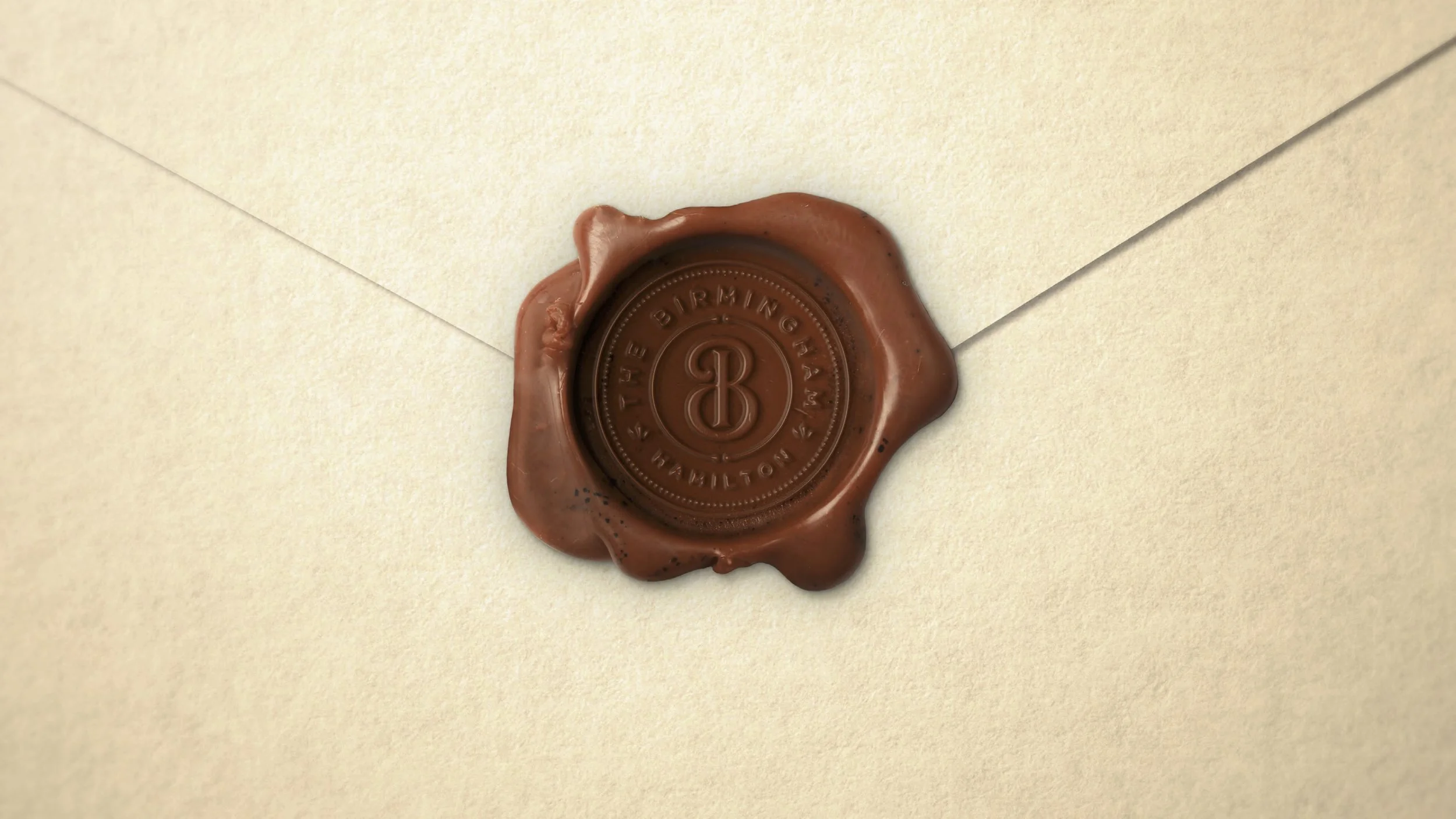
Set inside a former paper mill in downtown Hamilton, The Birmingham is a culinary-forward event venue built around food, drink, music, and gathering. From the outset, the brand needed to feel established and credible—something that belonged in the space immediately, not a look chasing novelty.
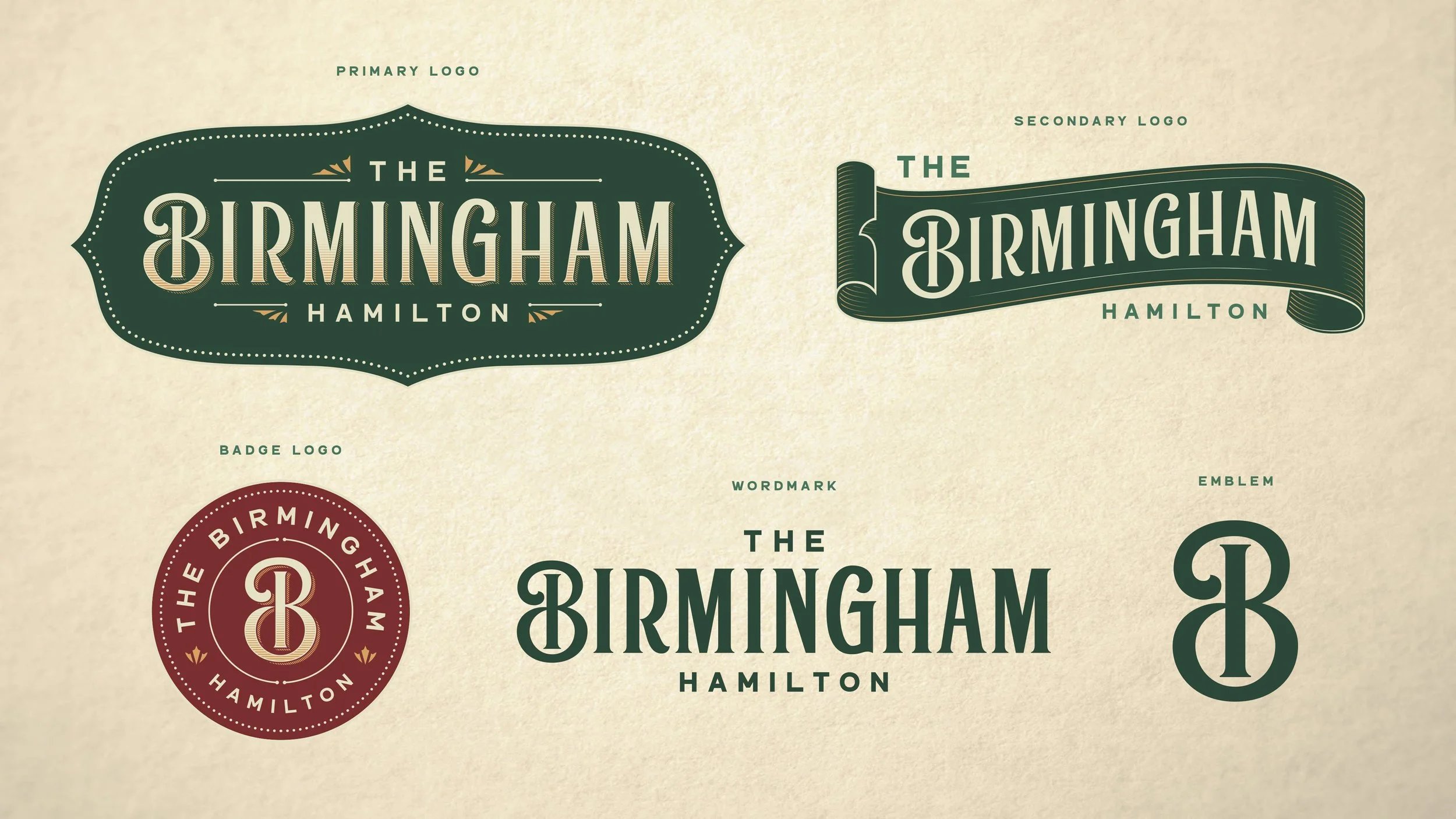
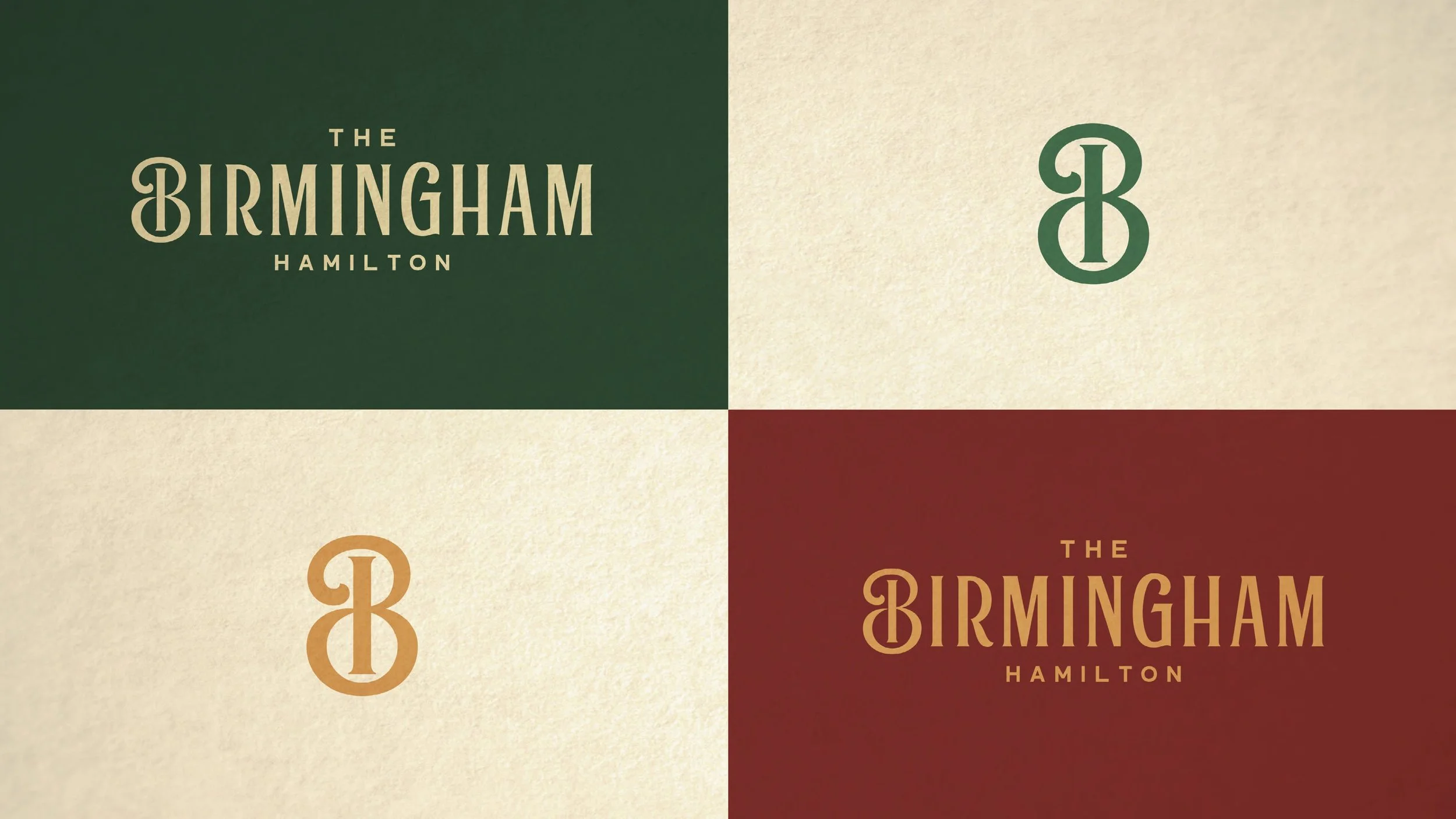
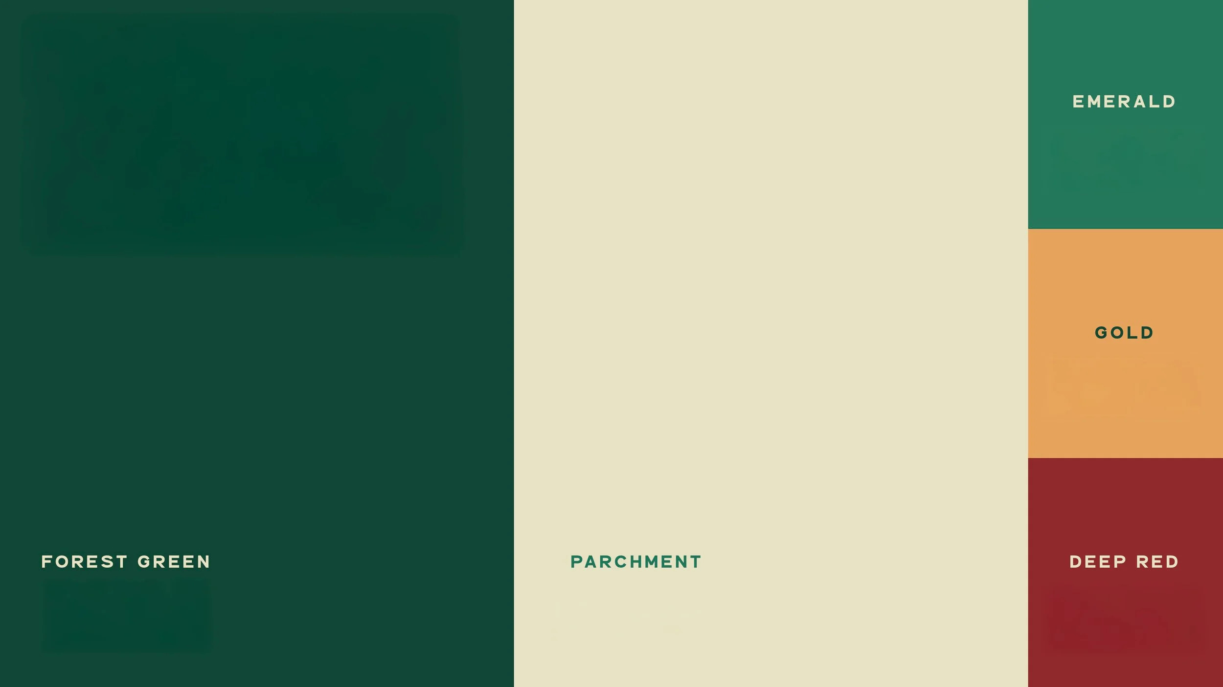
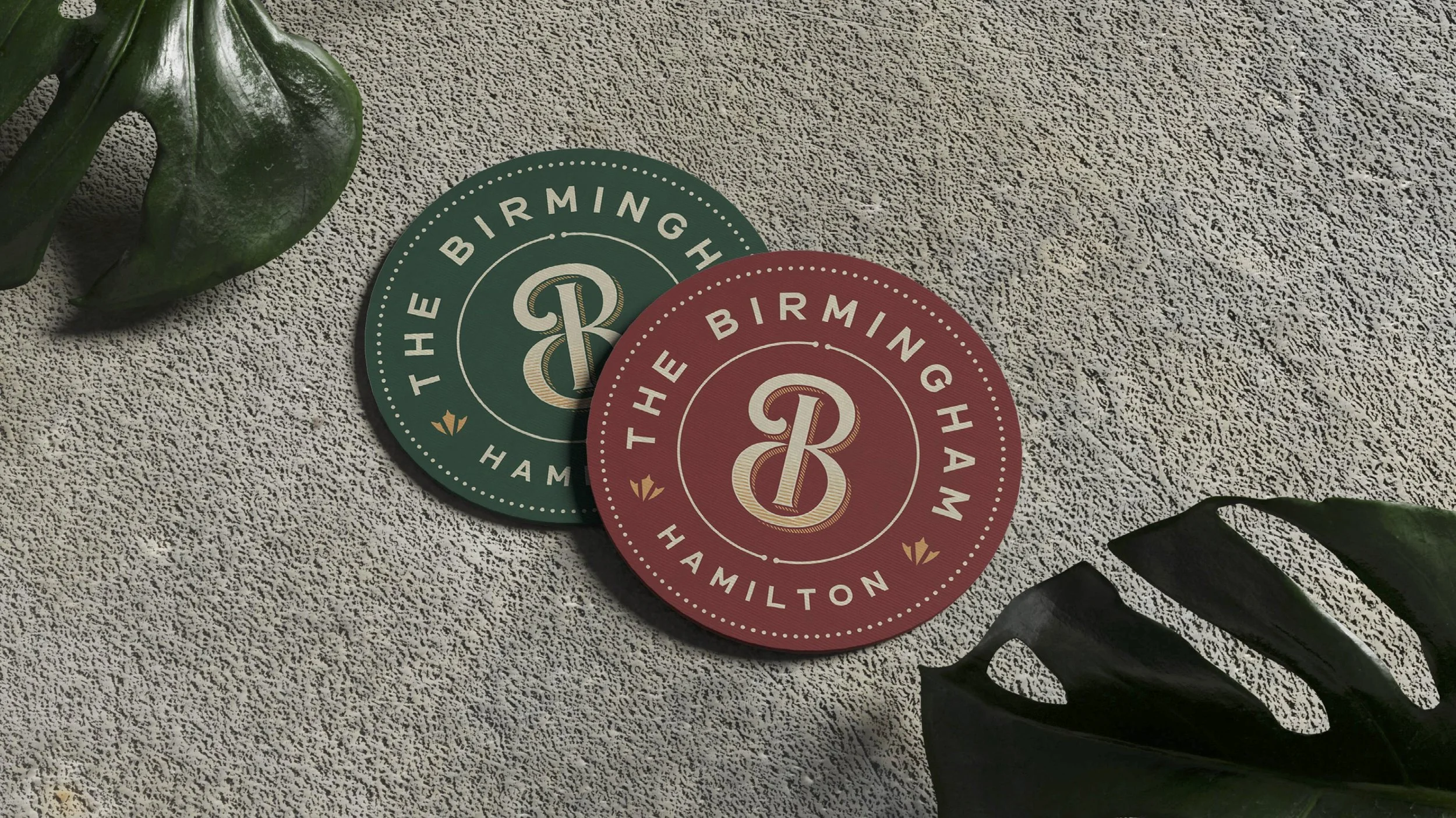
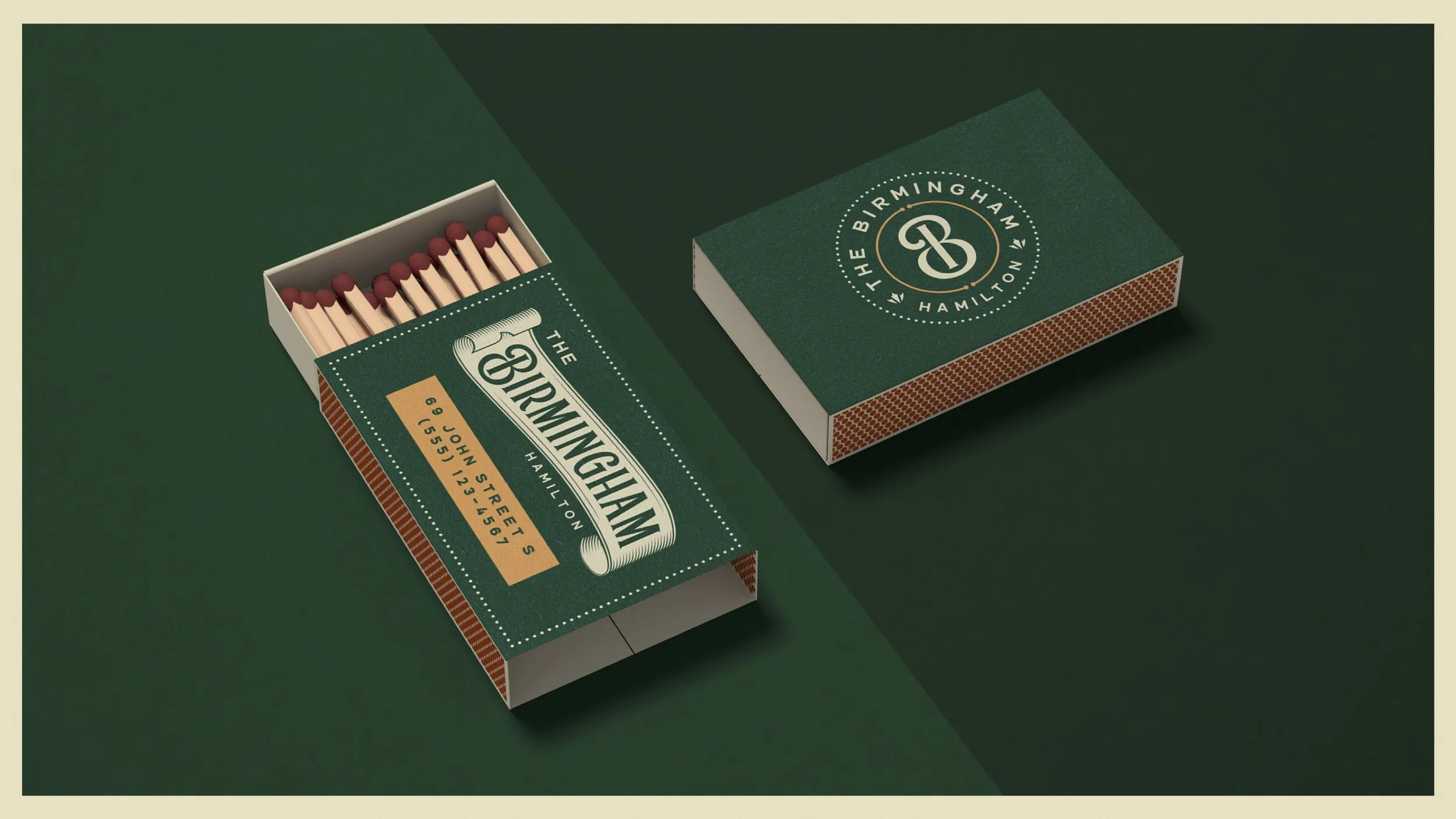
Our approach focused on refinement over reinvention. Drawing from historic hospitality, industrial craft, and the building’s past, we developed a logo system rooted in restraint and longevity. Custom typography and a simplified “B” monogram anchor the identity, supported by a grounded color palette that balances warmth with confidence.
The result is a brand that honors where the venue comes from while leaving room for what’s next—timeless, flexible, and built to live across signage, print, and physical space without losing its character.
-
Logo Suite, Colour, Typography, Pattern, Copywriting