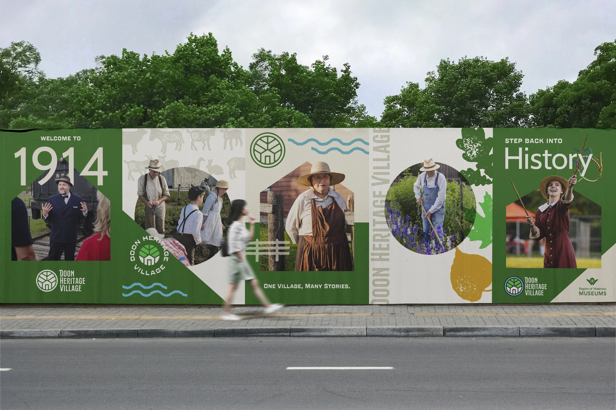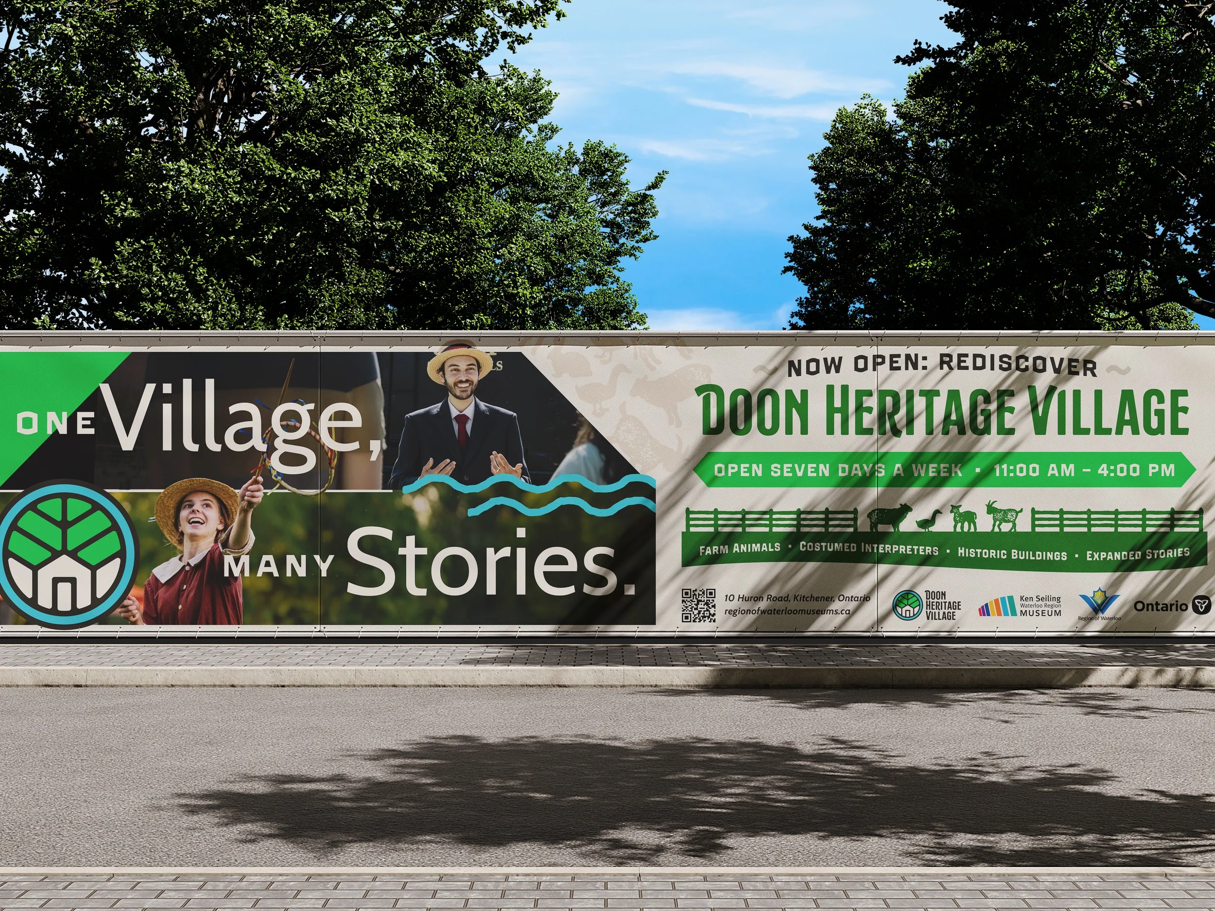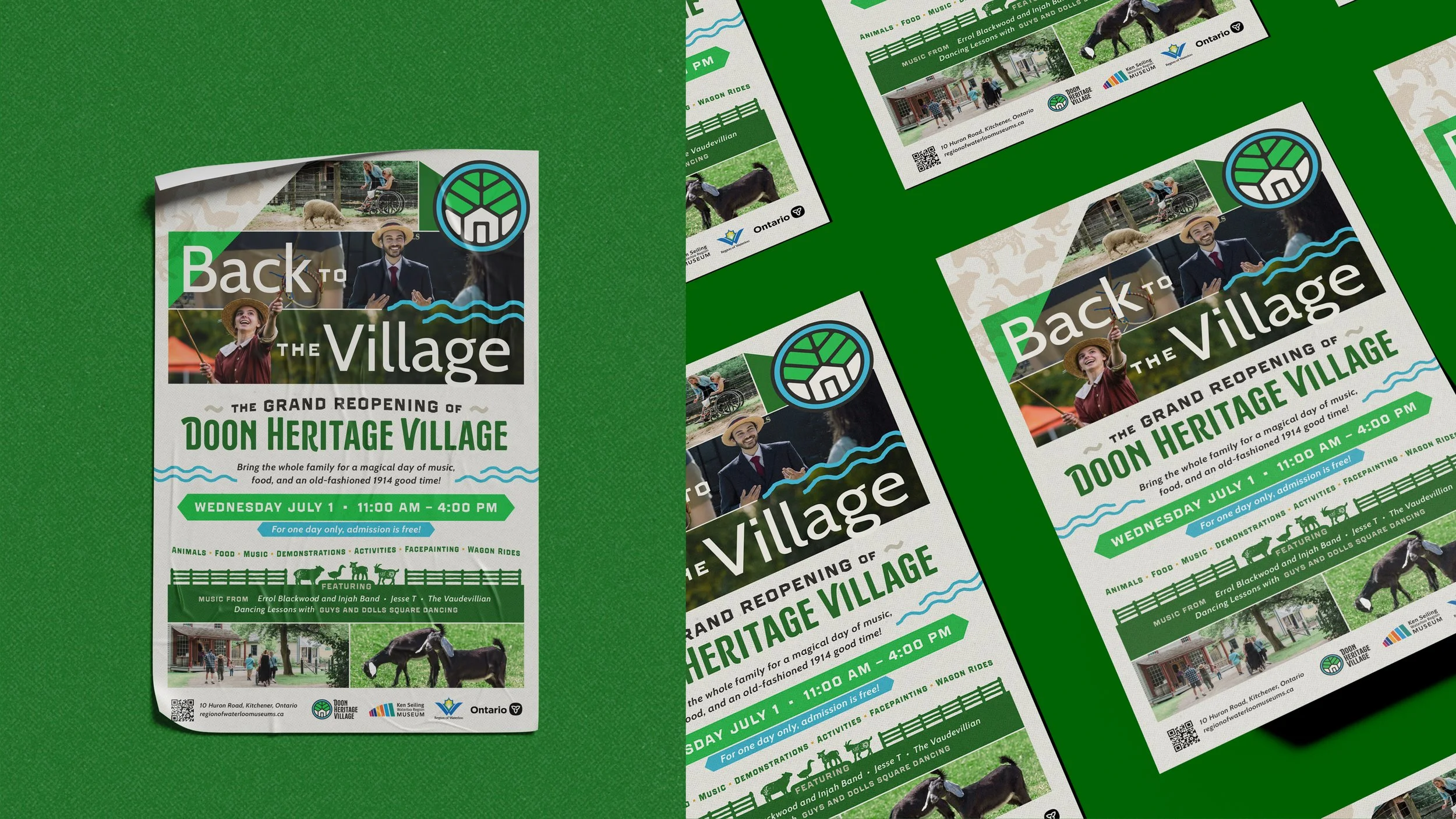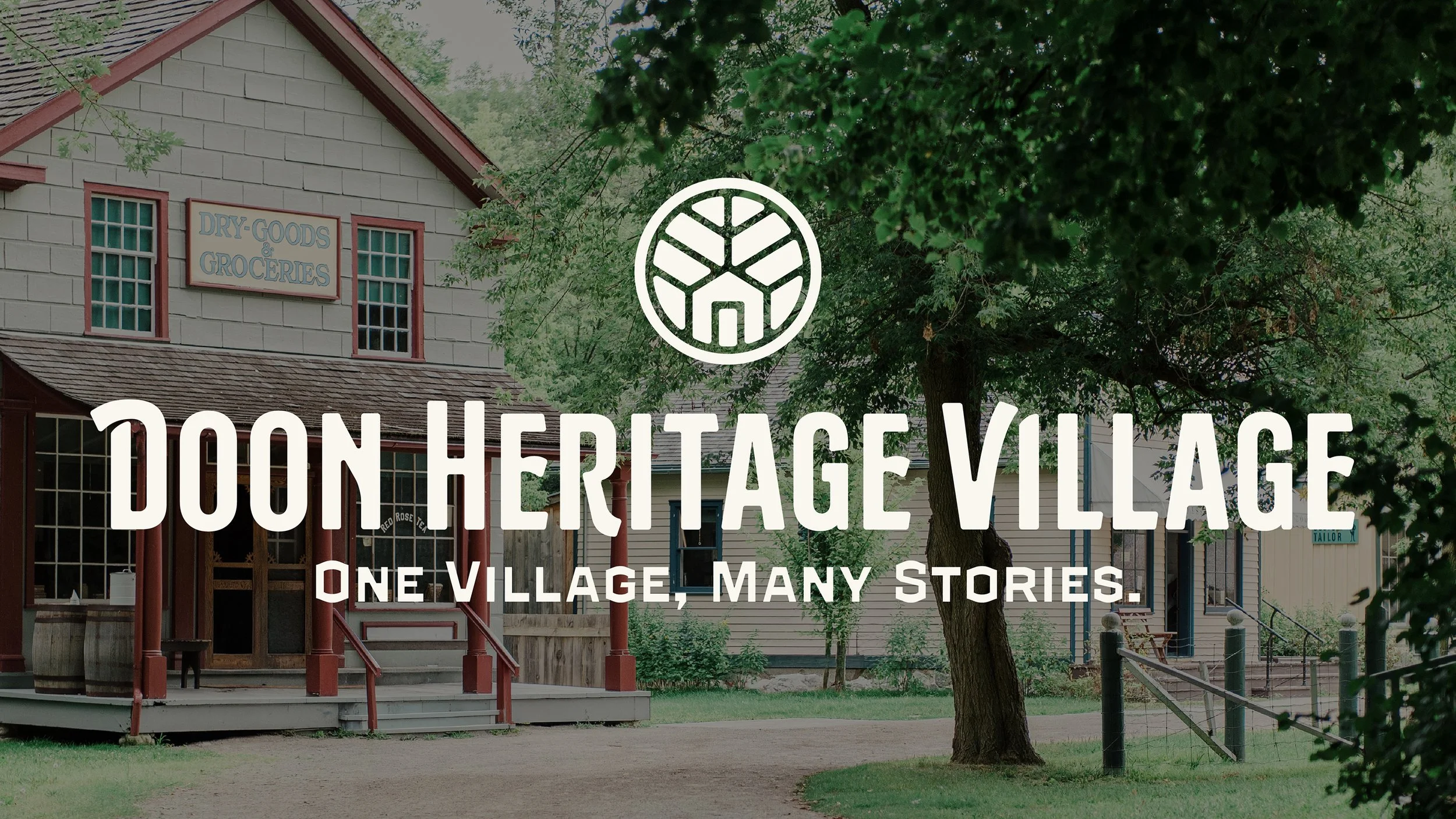
Re-Introducing a local landmark.
History has a way of feeling distant until you find yourself standing in the middle of it. Located in Kitchener, Ontario, Doon Heritage Village is a living-history museum that brings Waterloo Region's early 20th-century story to life through historic buildings, costumed interpreters, and hands-on experiences. Set in the year 1914, the village offers a glimpse into a community shaped by agriculture, craftsmanship, industry, and the everyday lives of the people who called it home.
With the village preparing to welcome visitors again following a multi-year closure, we were brought on to develop a new visual identity that could carry its story forward. The challenge was to create something rooted in the region's history while remaining approachable, recognizable, and flexible enough to serve a modern cultural destination. Our approach drew from the village itself, finding inspiration in the architecture, landscape, and visual traditions that make Doon such a distinctive place.
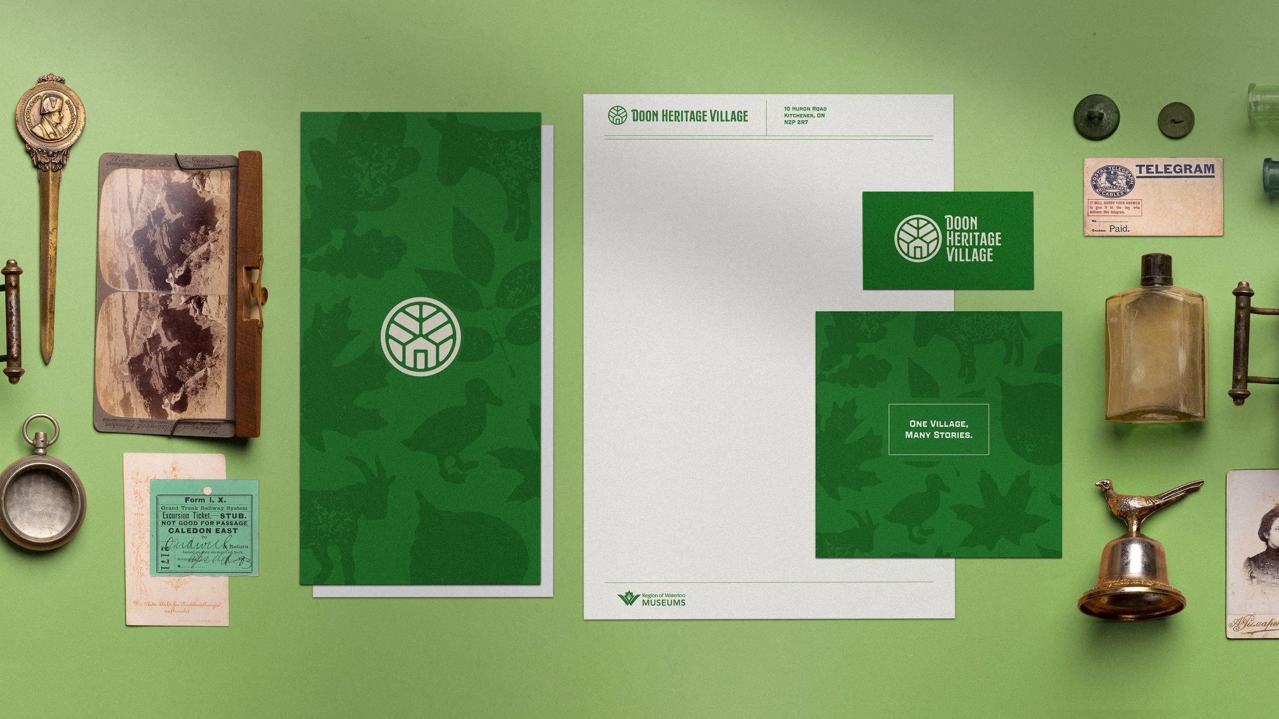
As we compiled early references that would help to guide our design process, we looked to the visual culture of the early 20th century for inspiration. Archival photographs, local advertisements, printed ephemera, and period lettering offered a window into how Waterloo Region, and the world at large, looked and communicated during this time.
These references helped establish a design language grounded in the region's history, drawing on familiar materials, craftsmanship, and graphic traditions to give the new identity an authentic sense of place.
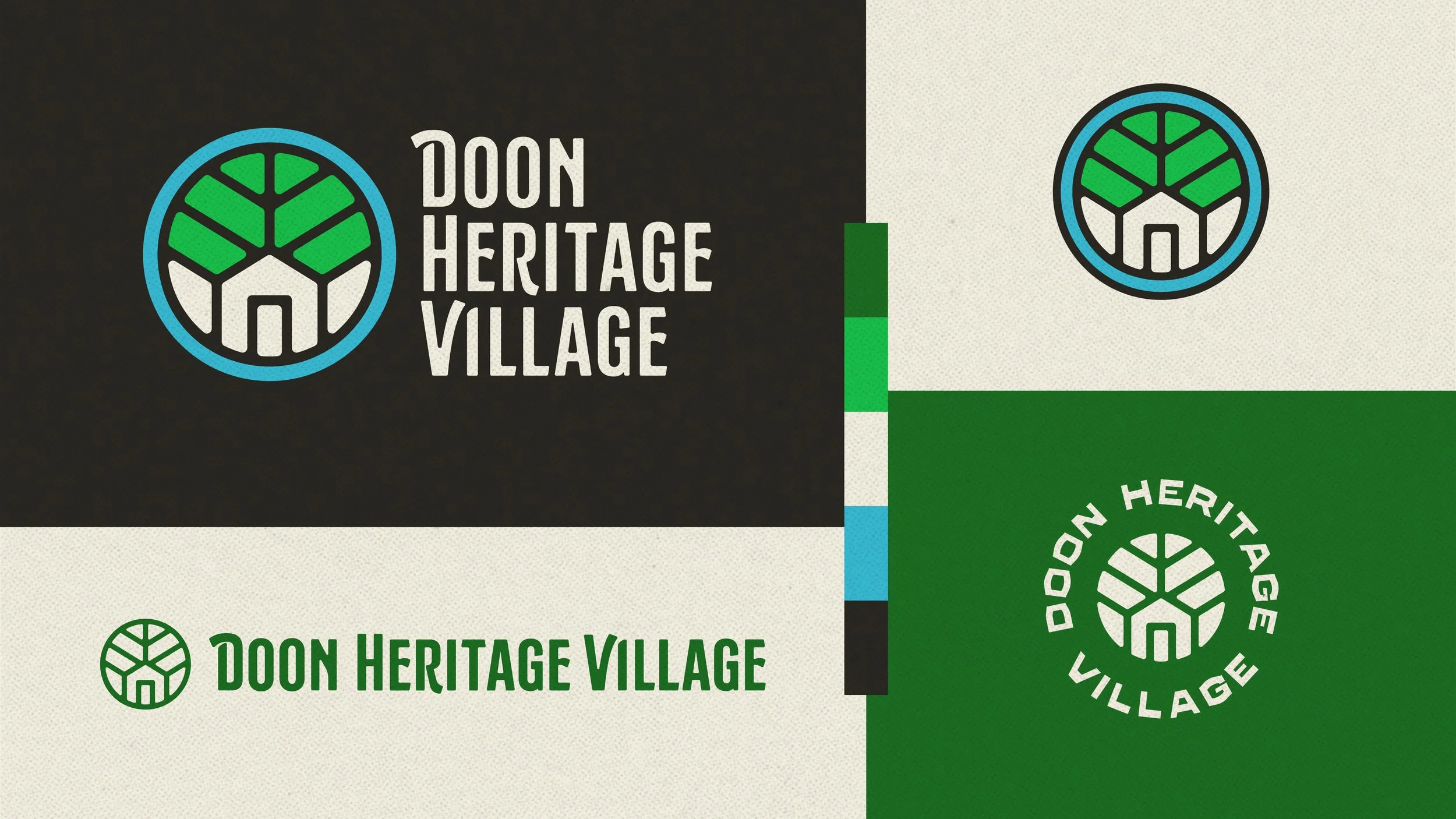
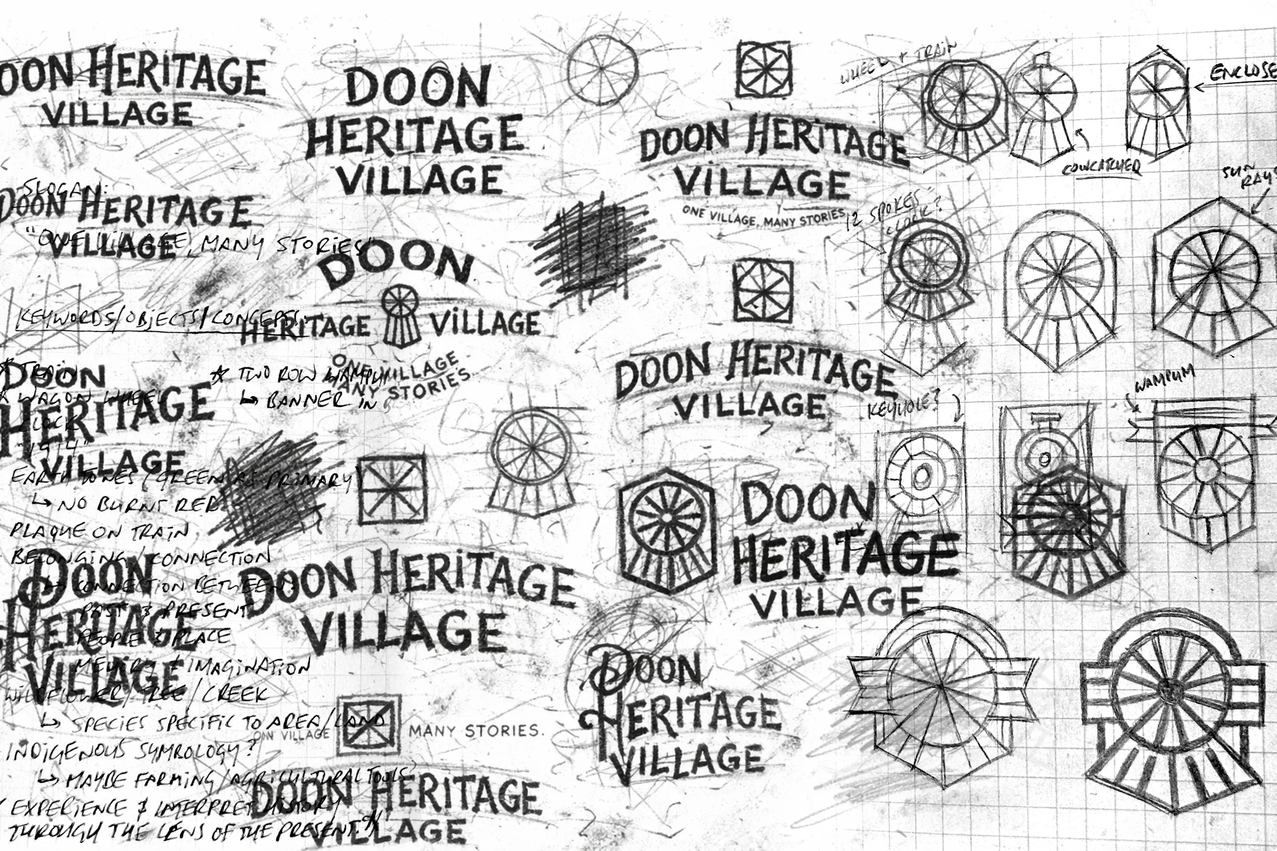
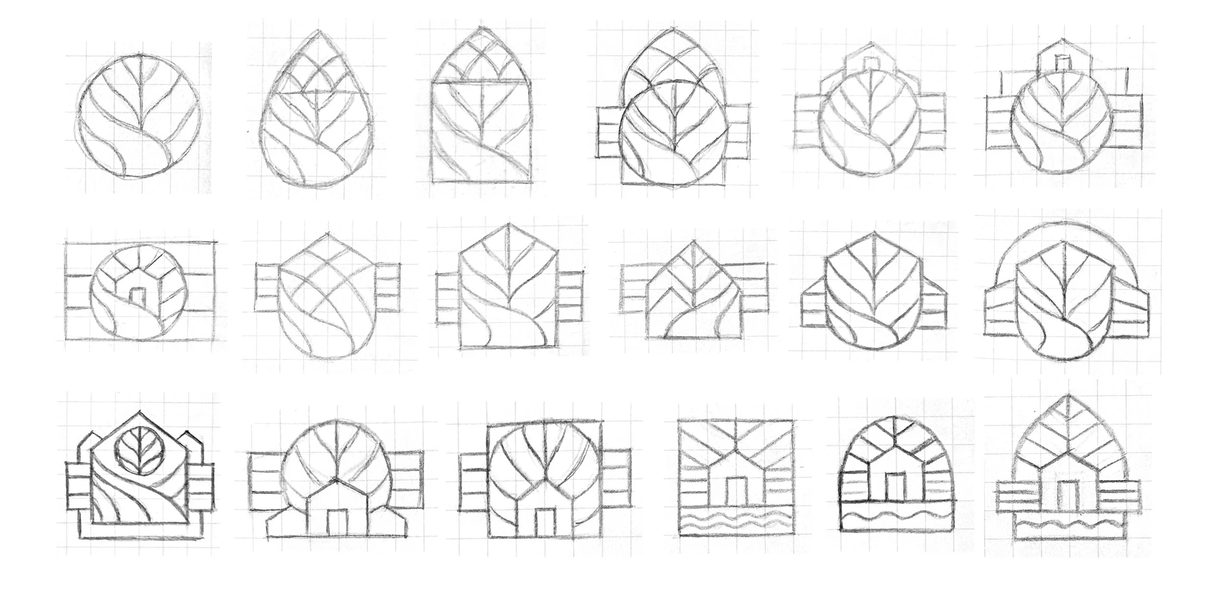
Our early explorations focused on defining the building blocks of a visual identity that could represent the village as a whole, capturing its distinctive character without relying too heavily on any single historical reference. Through rounds of sketching and ideation, we explored architectural details, natural landmarks, and traditional emblem structures, looking for a composition that felt recognizable, meaningful, and appropriate to the setting.
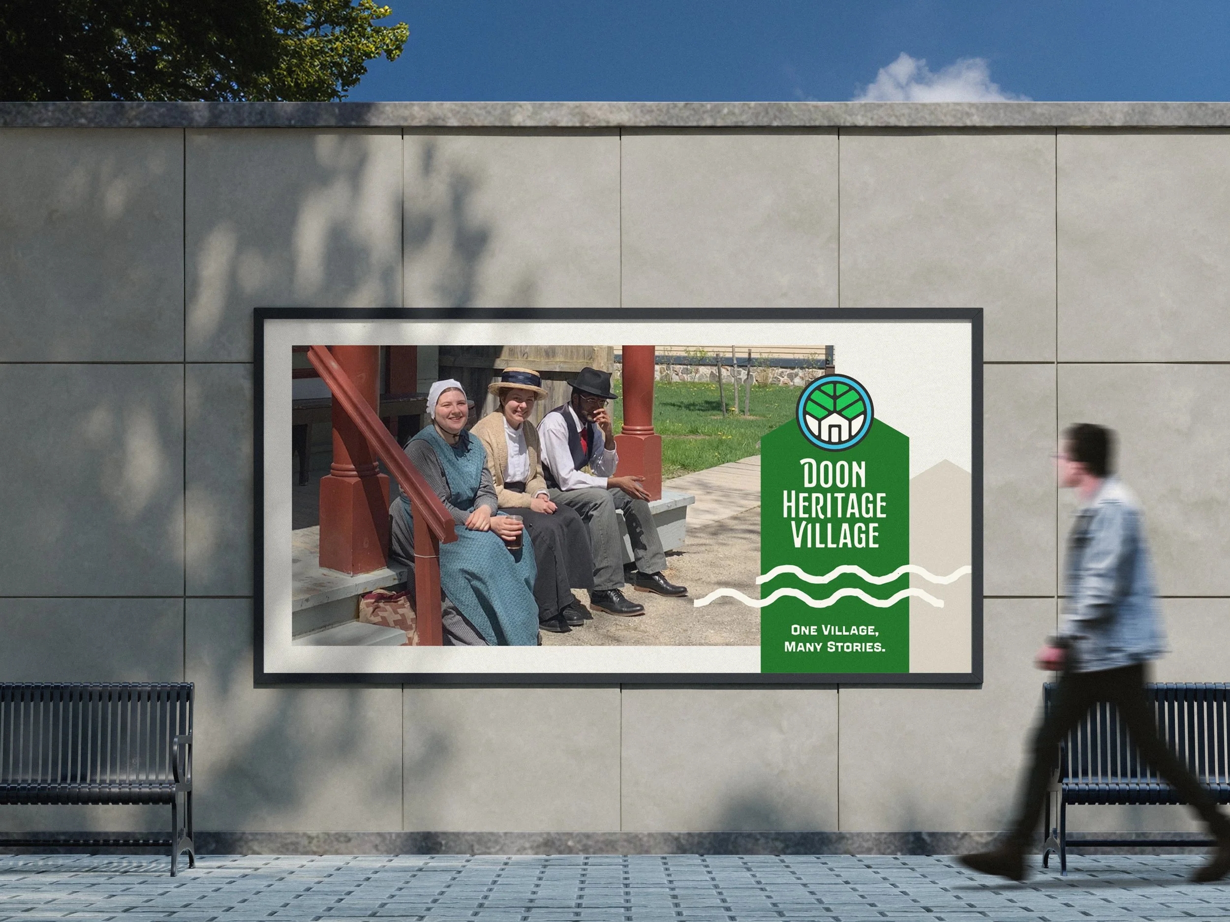
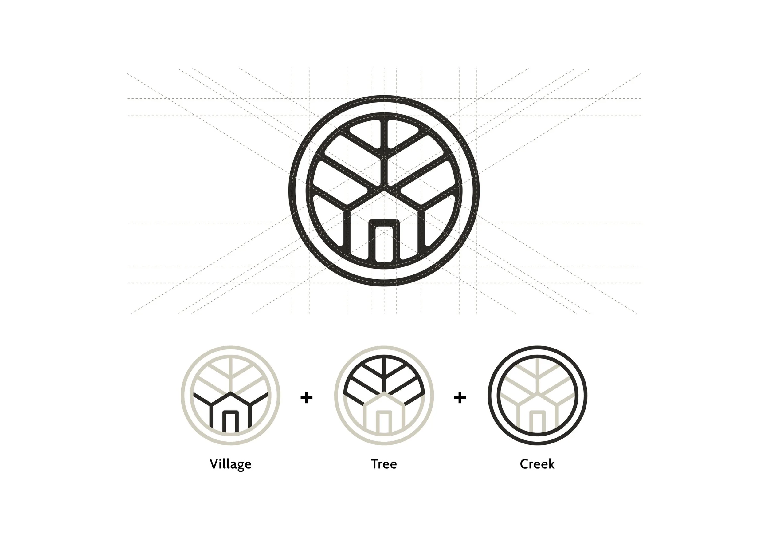
The resulting emblem brings together three defining features of the property: its historic buildings, surrounding tree canopy, and the creek that runs through the village. Carefully simplified and balanced, these elements form a compact symbol that reflects Doon Heritage Village’s physical character while providing a versatile foundation for the broader identity.

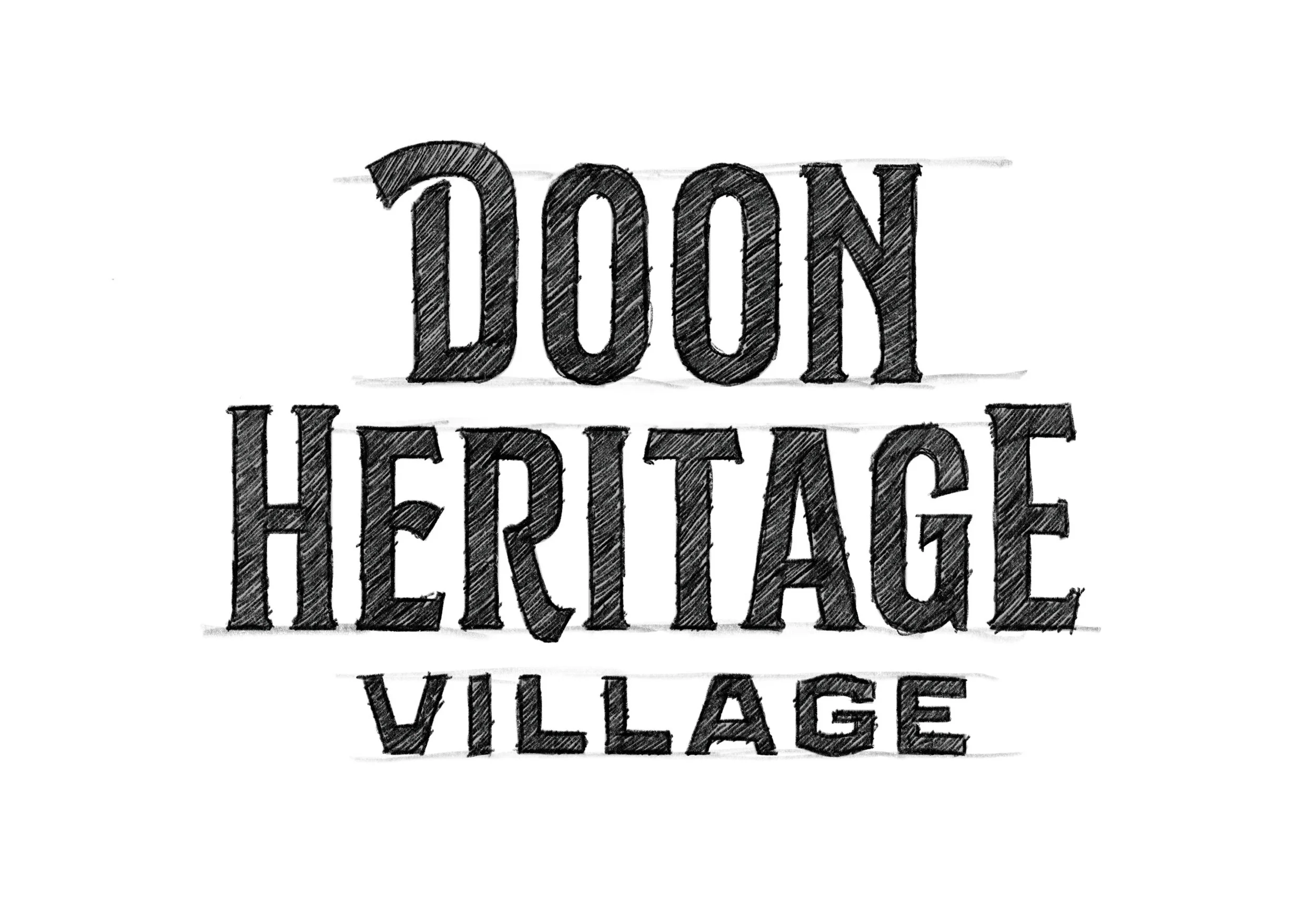
The custom wordmark takes inspiration from the lettering styles and typographic conventions of the early 1900s, with particular attention to the proportions, construction, and character of period signage and printed materials.
Through a process of refinement, we developed a distinctive set of letterforms that combines traditional influences with a more contemporary sense of balance and consistency. Subtle details in the shapes, spacing, and overall composition give the wordmark its own personality, complementing the emblem while establishing a strong, recognizable signature for Doon Heritage Village across a wide range of applications.

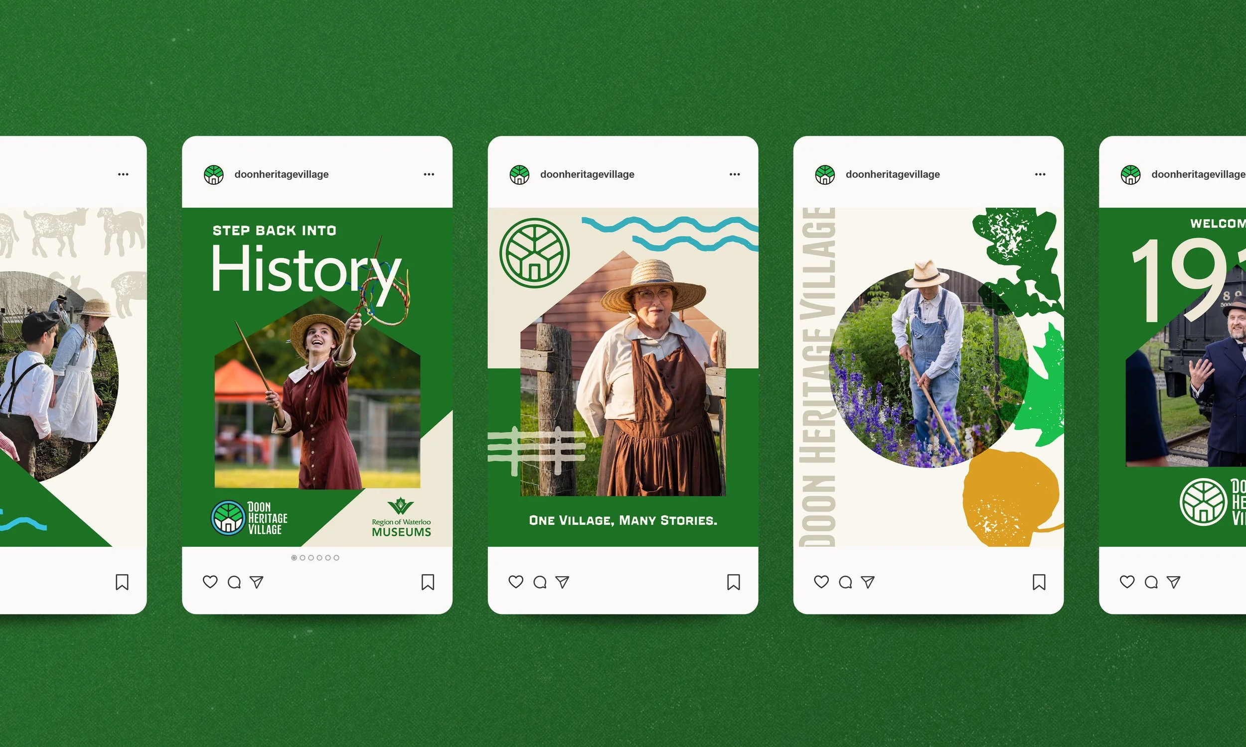
The year 1914 became an important reference point throughout the creative process. It was a period of transition, when longstanding agricultural traditions existed alongside growing industries and new technologies. We explored the printed materials, typography, colours, and graphic conventions of the era, using these references to inform a visual language that feels connected to its time and place.
An earthy colour palette takes cues from the village's natural surroundings and historic materials, while complementary typography and supporting graphics create opportunities for more expressive storytelling. Together, these elements establish a cohesive identity that can shift comfortably between educational content, visitor communications, and promotional materials.